Team lead in collaboration with two other HWE volunteers
Bringing a Storied Ensemble
to Life Online
Transforming a nonprofit ensemble’s website to match the pride and passion of its musicians and patrons
The Heisey Wind Ensemble (HWE) is a nonprofit ensemble of highly-trained musicians offering top-quality performances led by world-class conductors at accessible prices.They are a pride of the community, and as such have been able to operate continuously for 40 years thanks to the generous support of patrons.
40 years of performances
50+ musicians
Accessible performances
Patron supported
Problem
The Heisey Wind Ensemble website didn't convey their artistry or value, and it lacked the modern functionality, responsiveness, and accessibility their audience needed.
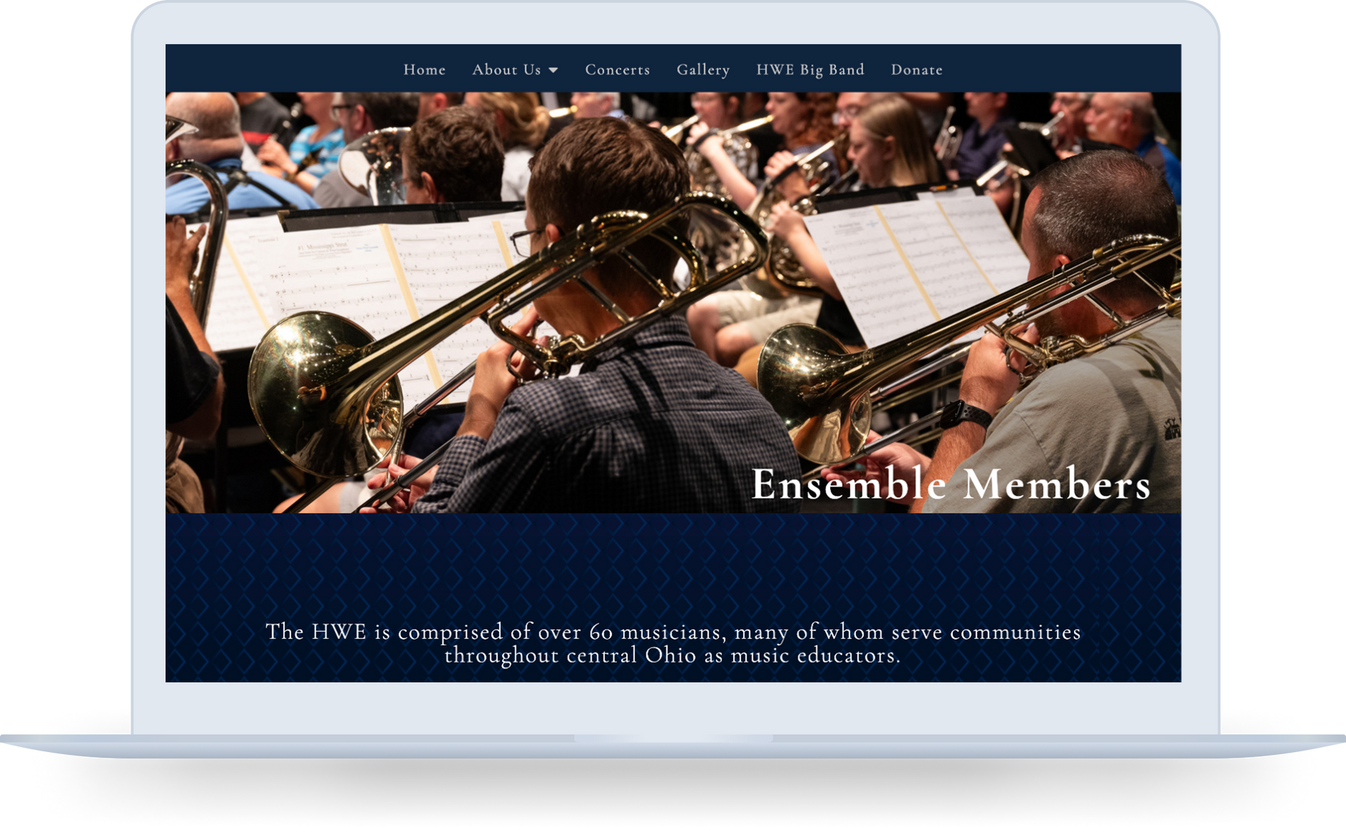
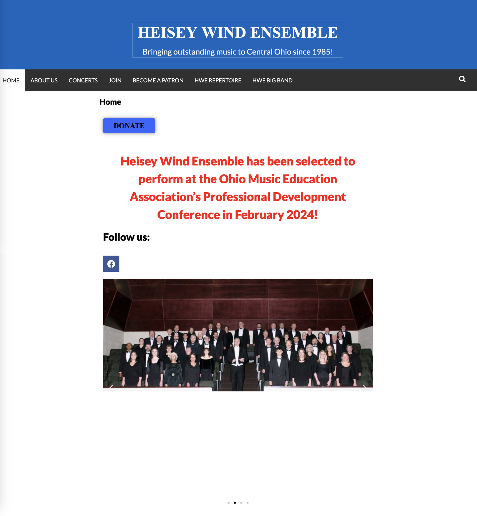
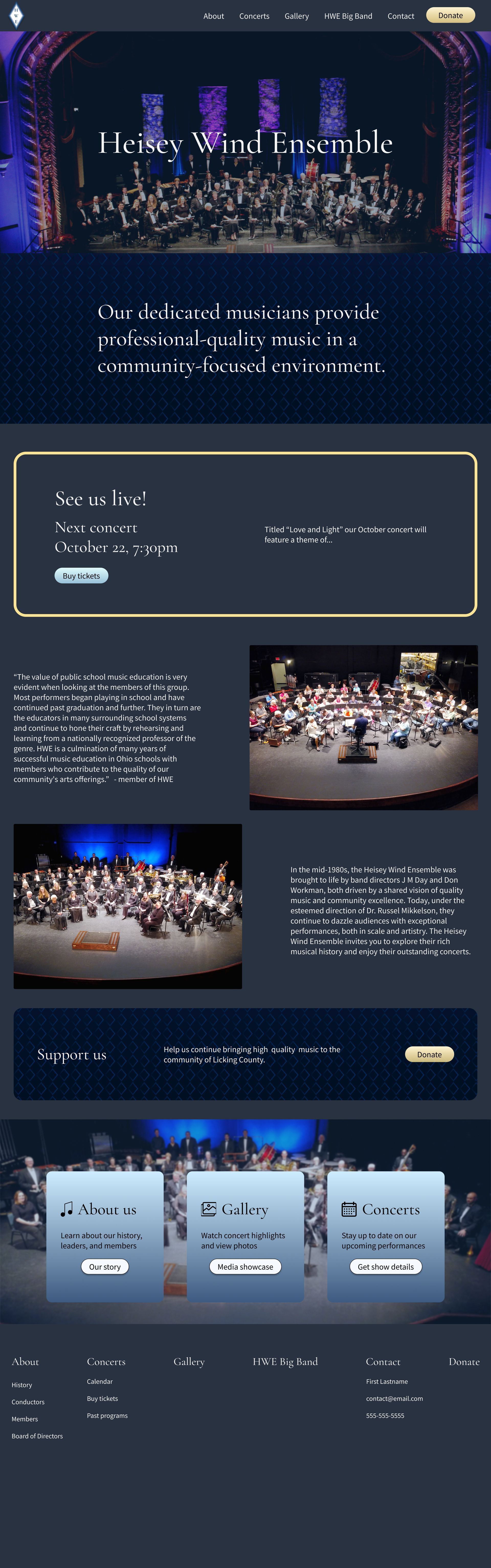
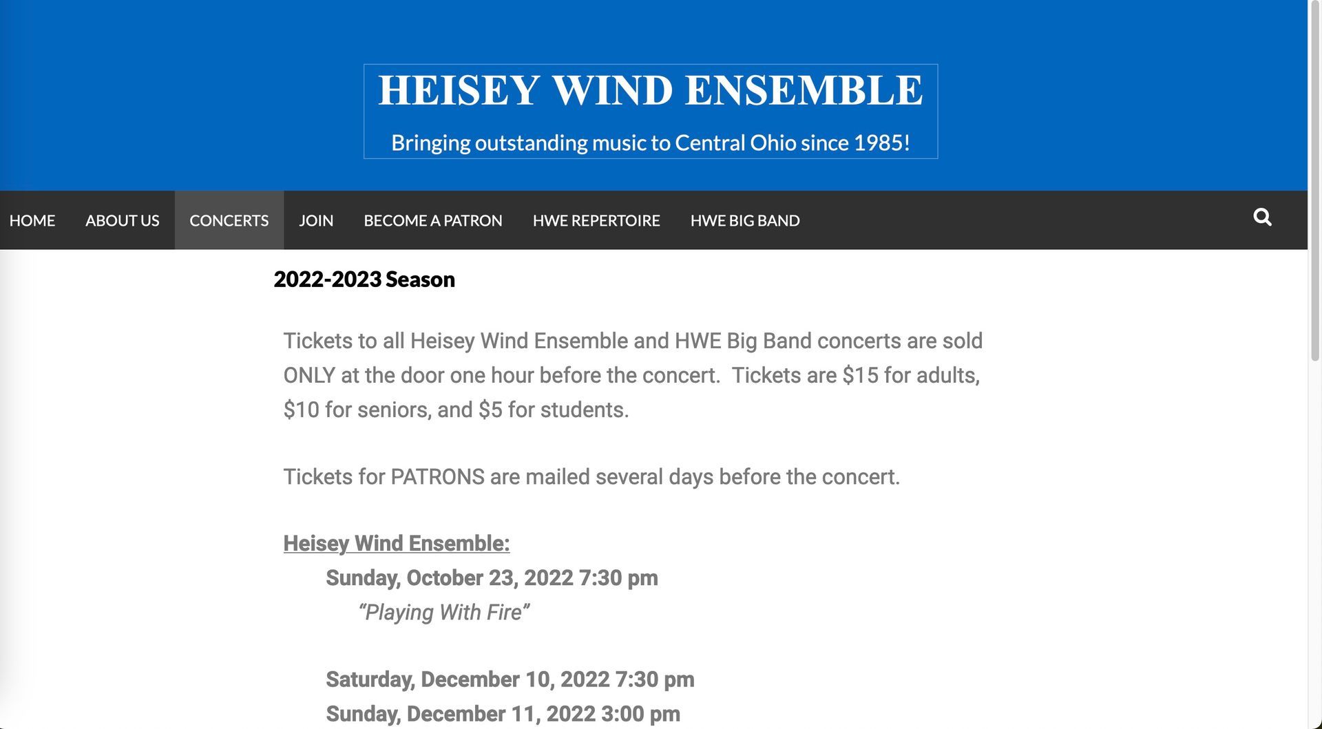
Before - Homepage
Simplified design lacks engagement or reflection of caliber of ensemble
Donate button is prominent but not reasons why to donate
Opportunities in navigation for restructuring
Lack of information on who the ensemble is
Lack of direction on what the user should do
Before - Homepage
Lack of direction on what the user should do
Opportunities in navigation for restructuring
Lack of information on who the ensemble is
Donate button is prominent but not reasons why to donate
Simplified design lacks engagement or reflection of caliber of ensemble
Solution
The redesign centered on storytelling, clarity, and accessibility - bringing the Heisey Wind Ensemble's artistry into a modern, usable experience
Accessibility
Responsive design
Information architecture
New content
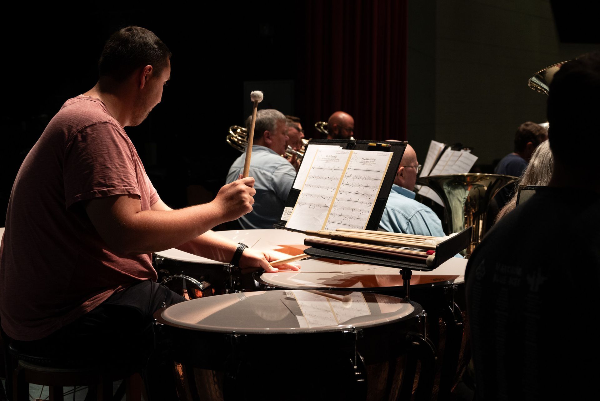
Photography
Site functionality
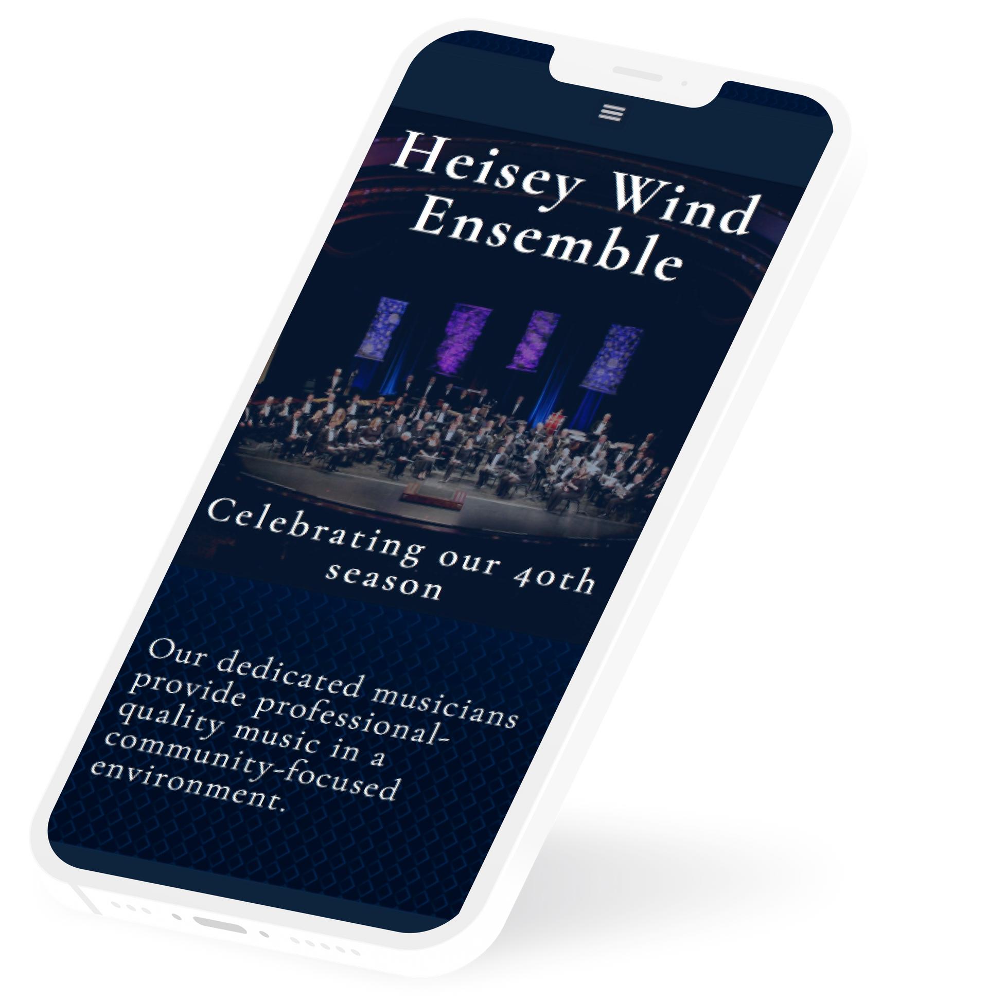
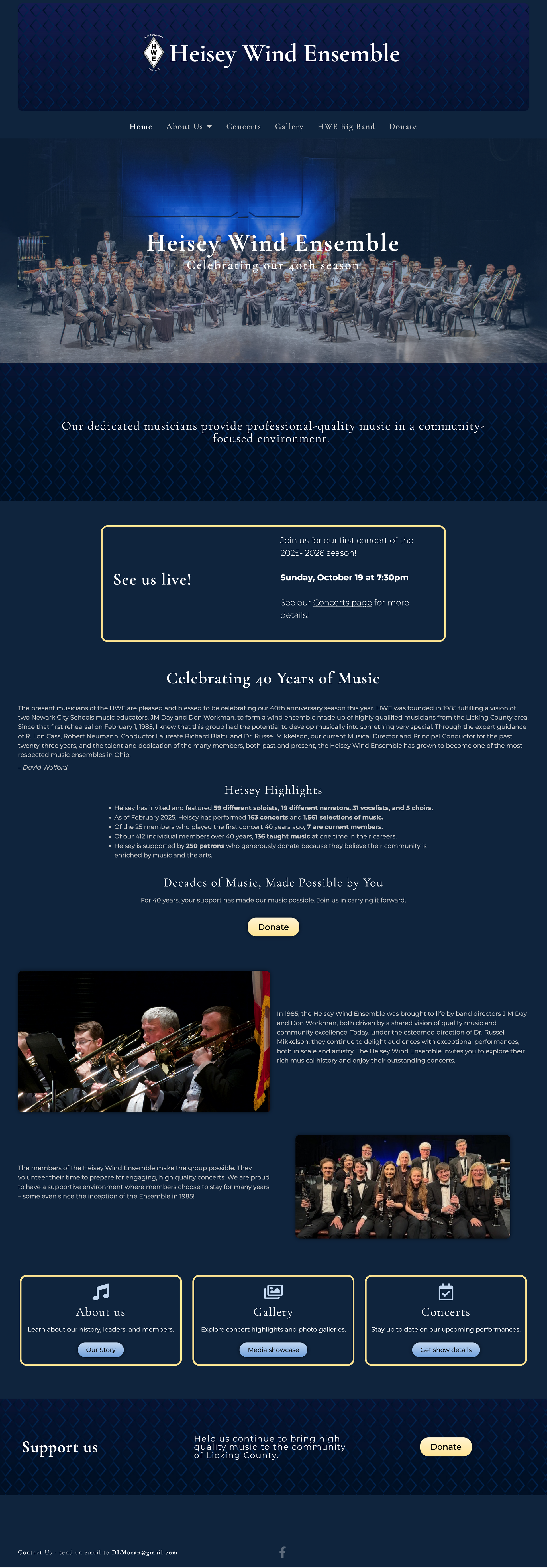
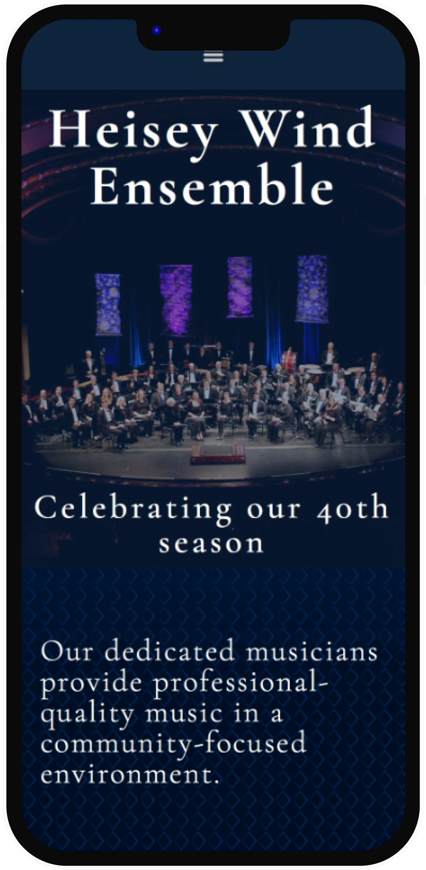
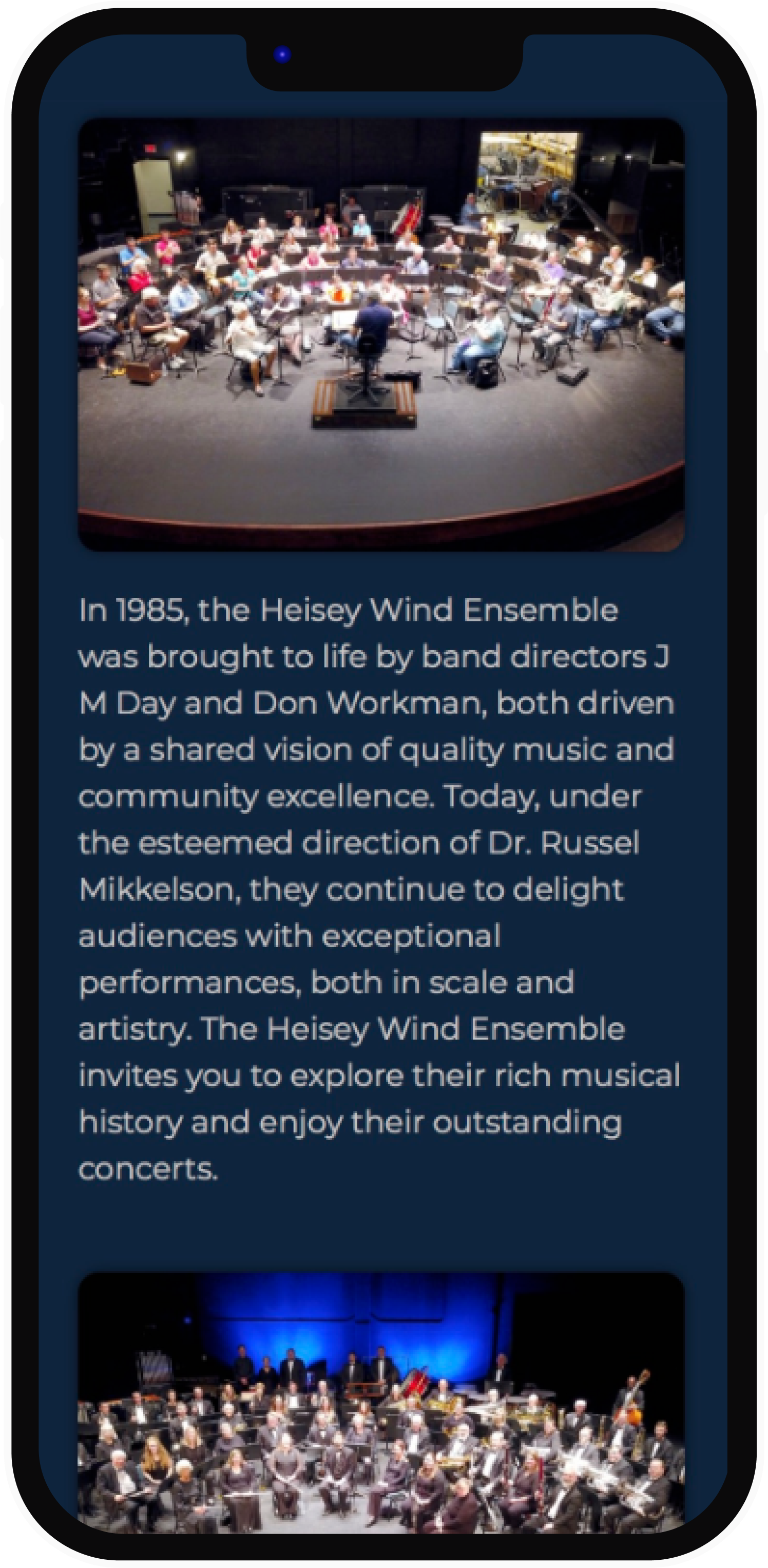
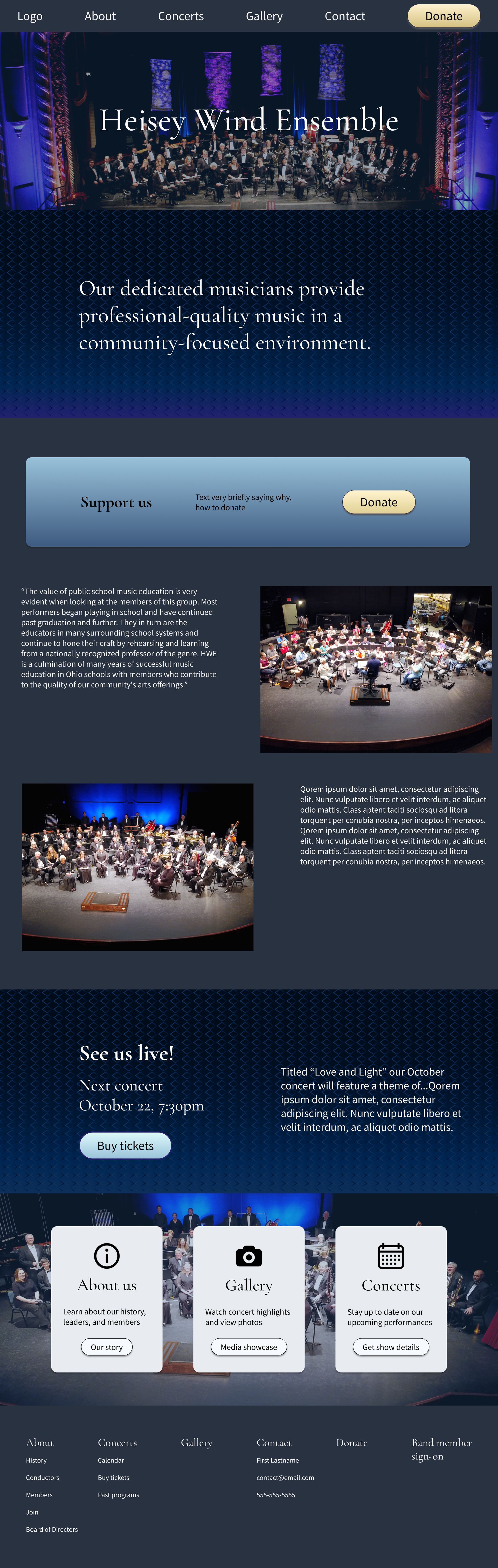
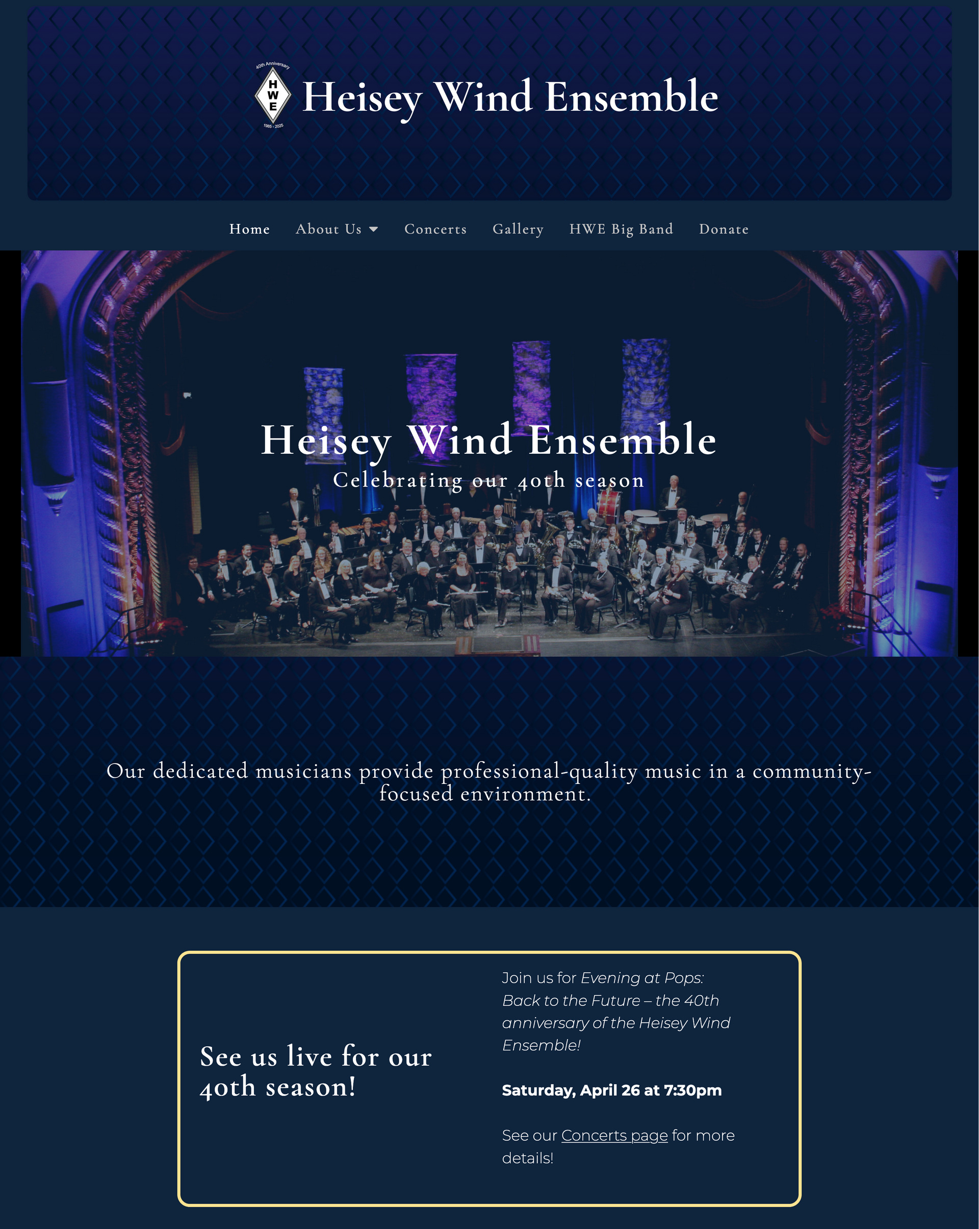
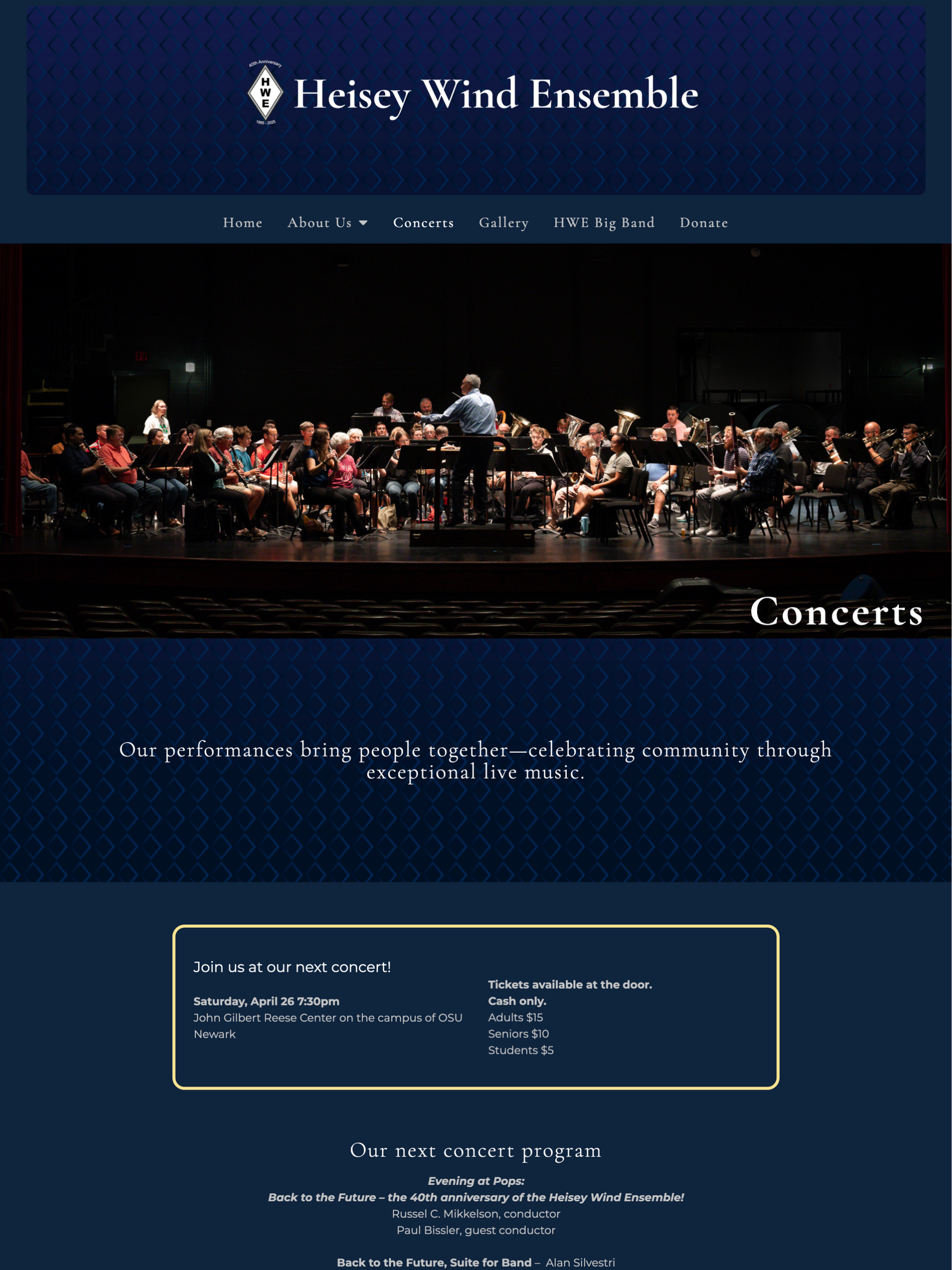
After - Homepage
Brief history of ensemble and their community value
Updated photography
Links to more information
guides user to explore site
CTA with description and leads to page with more details
Custom-made background emphasizes HWE branding
Announcement box highlights actions for users
Enhanced clarity, ease of use in page and site structure
Connecting two distinct user groups with common Values
Balancing Design for an Older Audience and Younger Musicians
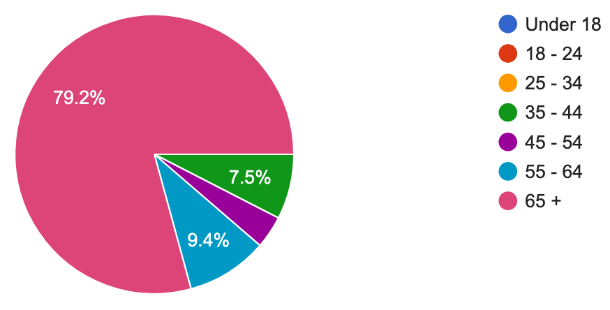
Data was analyzed from 85 user surveys that sought to learn:
Pain points from old website
Desired changes to website
Values users hold about the ensemble
"I need to understand more of the community impact, representation, and need for funding, how [donations are] used"
- User explaining why they have not donated to the HWE
"The home page does not display anything that I want to see. I think the home page should display what we believe the viewer is MOST likely looking for, with quick links that take the viewer to the next most likely thing.”
- User reflecting on frustration with old site
"[I want to] view an attractive website that quickly and easily displays concert times, advertises what is special about each concert, provides information about the ensembles history, and encourages me to enthusiastically donate funds to support a local organization I care about."
- User describing expectations for website
79%of audience members are aged65+
The research shows that users want a website that illustrates and reflects the unique story of who is the HWE, builds community engagement, and accomplishes these through modern features integrated into the site.
How does the research impact design choices?
Accessibility
Considerations for font size, color contrast, touch point sizes, and alt-text.
Content
Update content to be more informative in an engaging, storytelling way.
Functionality
Use responsive design and Investigate new functions such as buying tickets online.
Structure
Clear navigation labels and calls to action.
Iterate and verify quickly with team and users
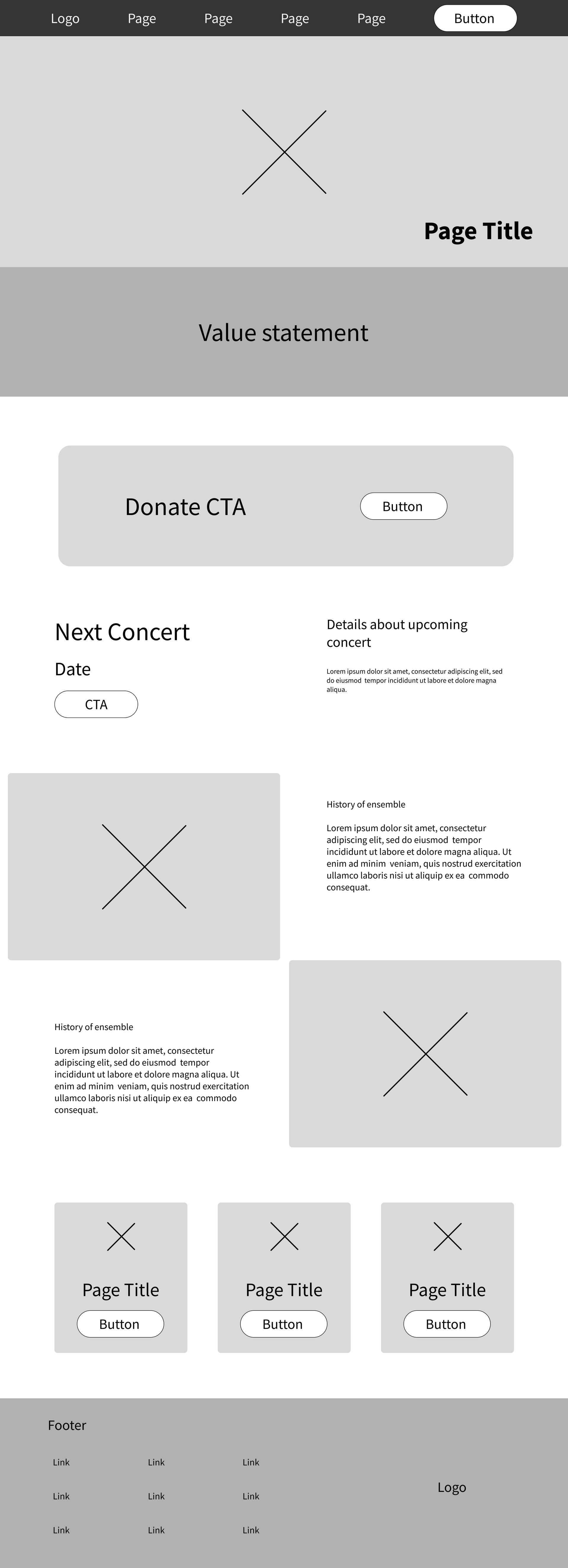
Proposed Mid-fidelity wireframes for concept validation and adjusted for High-Fidelity screens
"The donate button so high up on the page makes me want to scroll past it. I don't know why I should donate yet."
- User feedback
Page restructured for high-fidelity wireframes, then presented to the Board of Directors.
collaborating with stakeholders to ensure a successful design
Presenting designs to the Board of Directors
The Board of Directors approved of the overall design and debated whether to pursue new functions that came up in user testing: a way to buy tickets online and to have members only areas. They ultimately decided to pause on those functions until a future time. The remainder of the design was approved to build on WordPress and Elementor Pro.
Keep focus on storytelling
and information architecture
Approved visual design
Great use of photography
Remove online ticket purchasing
Remove member's only functions
Bringing the Design to Life and Preparing It for the Future
Leading the build in WordPress/Elementor Pro and ensuring the ensemble can maintain the site long after launch.
To keep the experience consistent over time—despite changing volunteers—I created clear documentation, provided guidance during development, and structured the site so future members can confidently maintain it.
Style
Guide
Defined typography, color, spacing, and reusable components to maintain visual consistency.
Development Guide
Outlined how to implement each page in WordPress and Elementor Pro, supporting smooth build-out and maintenance.
Collaboration Handoff
Shared documentation and aligned with teammates to ensure consistent development across roles and skill levels.
Sustainable Maintenance
Designed the system so future volunteers can update the site confidently without relying on specialized tools.
Creating Elegance through Design Principles
Final user feedback and going live
After the website build, all content was reviewed by our team, the Board of Directors, and by test users who were in the primary demographic for the Heisey Wind Ensemble.
"THis looks Very professional, enticing, and like a great opportunity to enjoy great music"
User Feedback
Before and After
Lessons That Strengthened My Approach
Communicating ideas clearly, adapting the UX process, and maintaining continuous iteration after launch.
This project was a joy to work on and allowed me to integrate various passions and skills at once - UX design, photography, website development, collaboration, and leadership. I also gained these important takeaways:
Guide Stakeholders With “How,” Not Just “What”
In the future, pair new ideas with visual implementation paths to reduce hesitation and speed alignment.
Adaptability in Non-Linear Processes
Deadlines meant shifting steps, where learning to make strong decisions within constraints was key.
Design Doesn’t End at Launch
Ongoing improvements taught me how design choices evolve in real user environments.
Testimonial
Kerry McNamara’s work on our website was professional, creative, and efficient. The site looks great and functions intuitively. I couldn’t be more pleased!
Dr. Russel Mikkelson, Director of the Heisey Wind Ensemble