Design
UX + Product + Web + Graphic
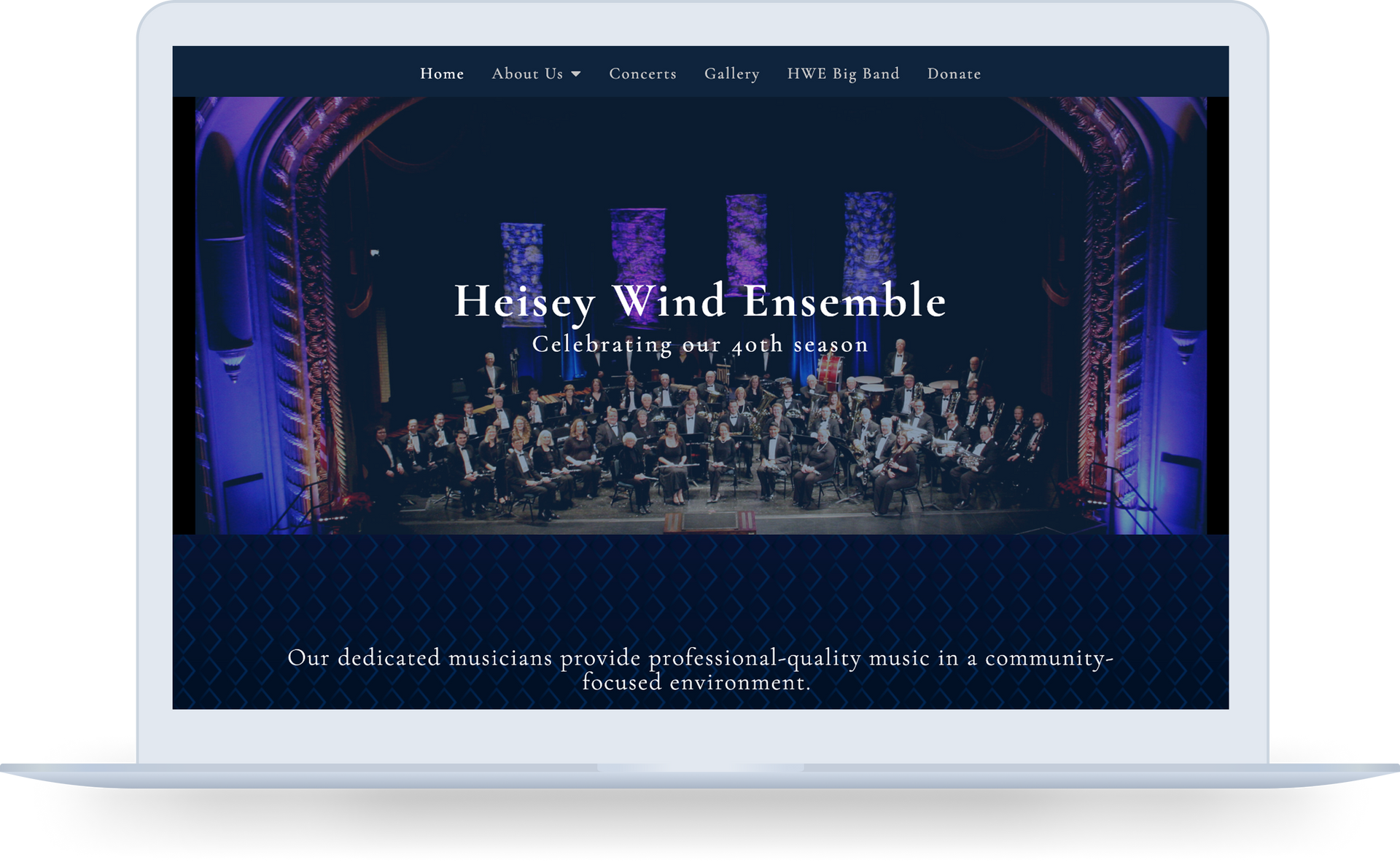
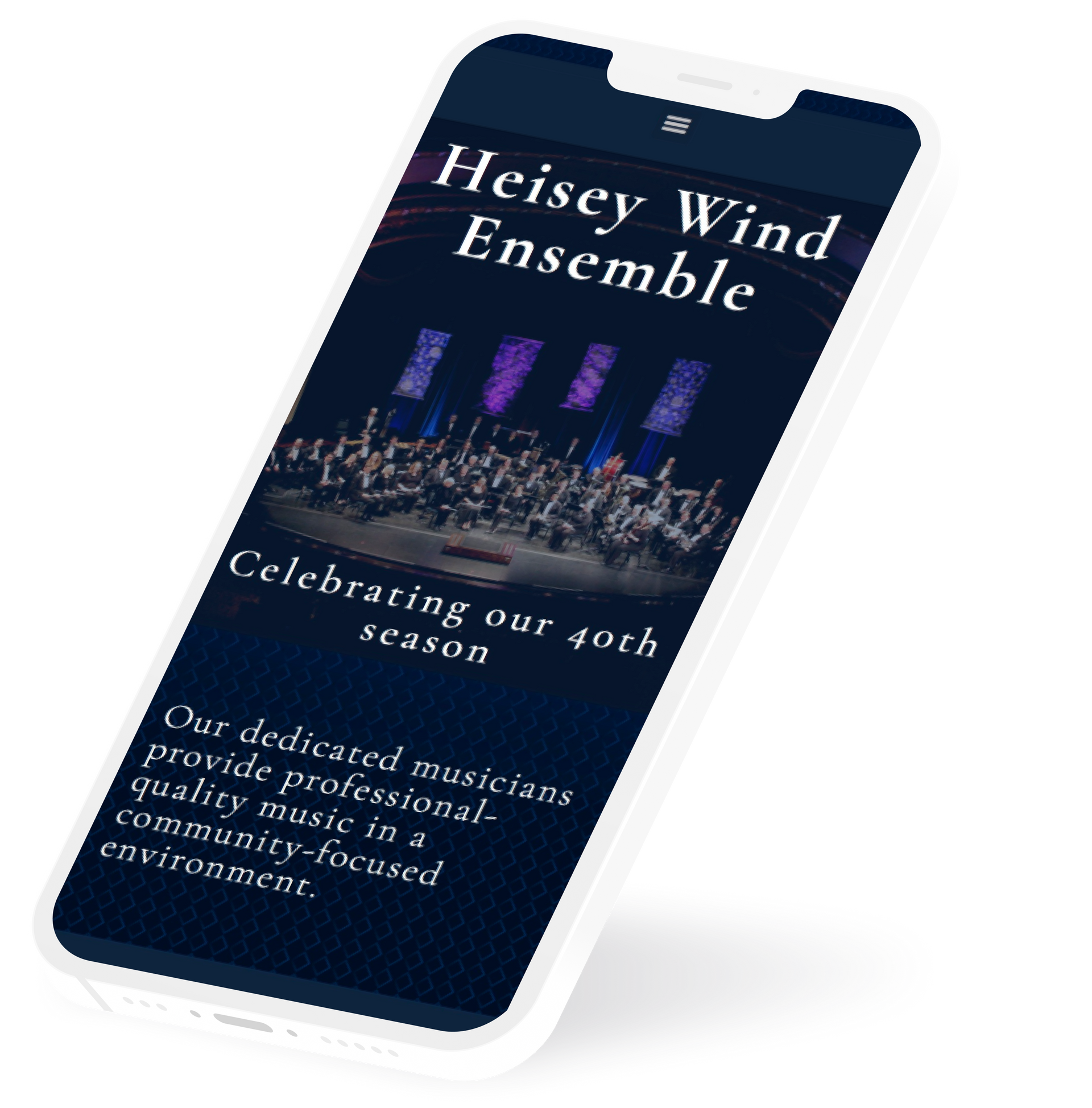
Translating Artistry into Digital Presence
This project brought a respected ensemble’s identity online, aligning the website with its values and mission while enhancing trust to support donations.
A Century of Innovation.
An Outdated Website.
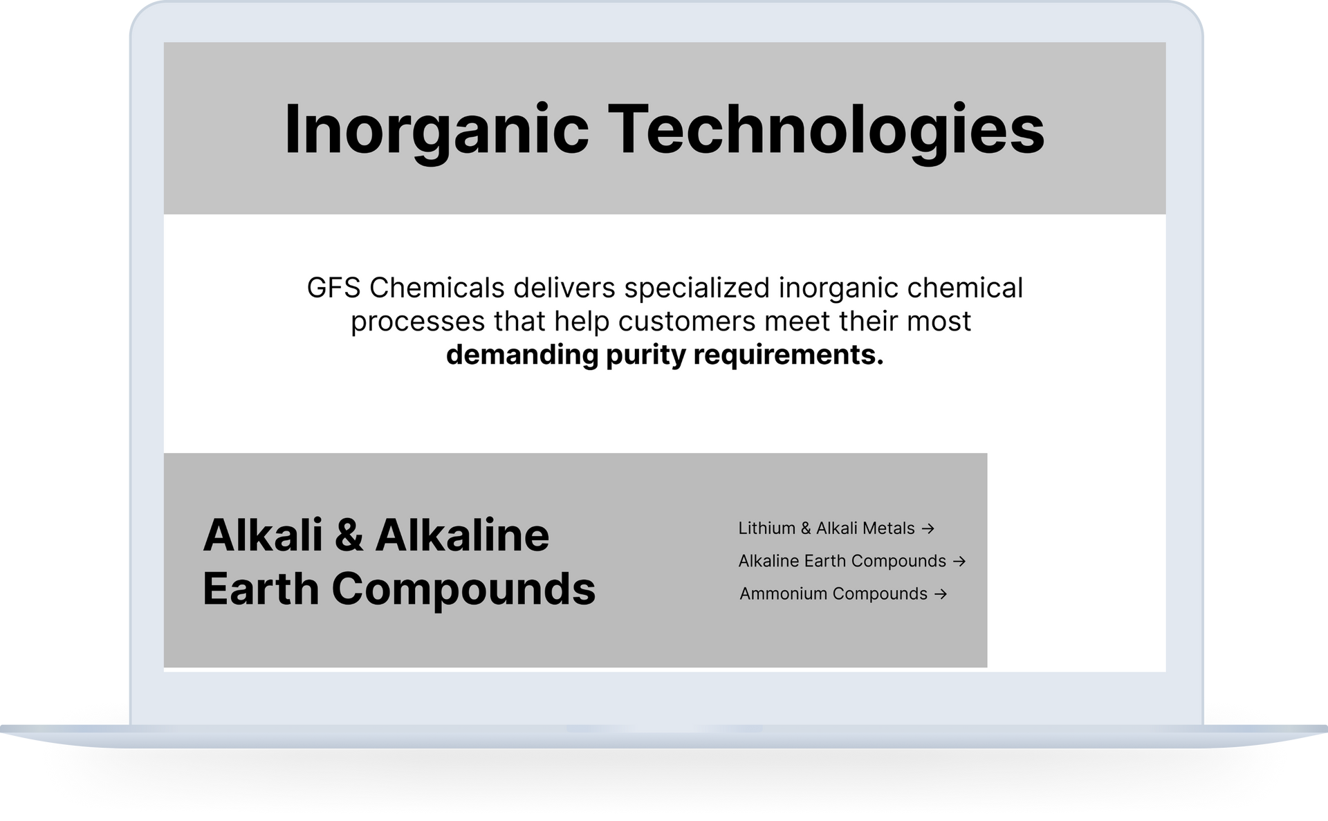
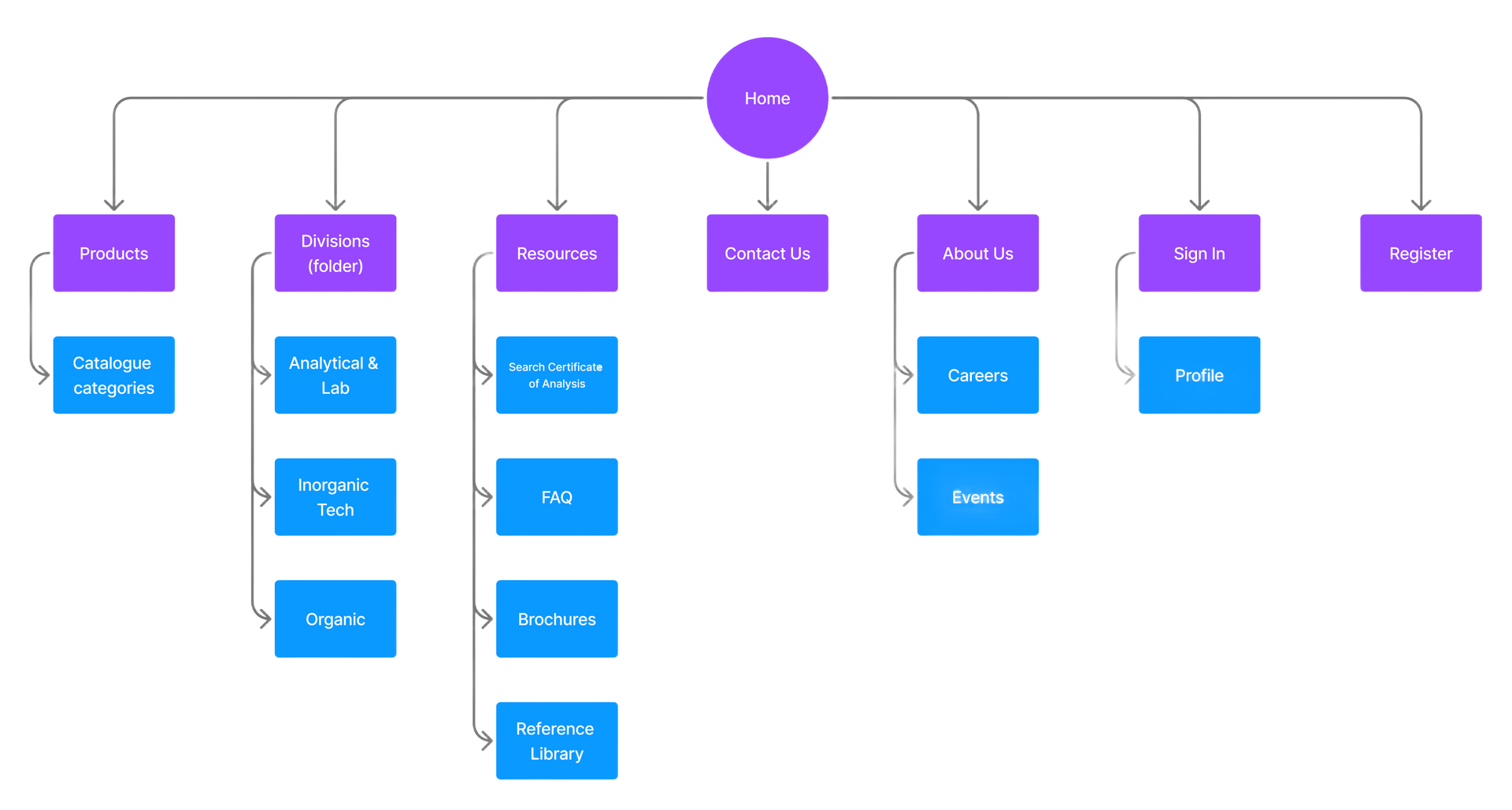
Led the structural UX process — audits, IA, wireframes — within tight technical constraints to guide a legacy B2B site redesign that drove a 13% YoY sales increase in its first month.

Redefining Self-Care for
Busy Parents
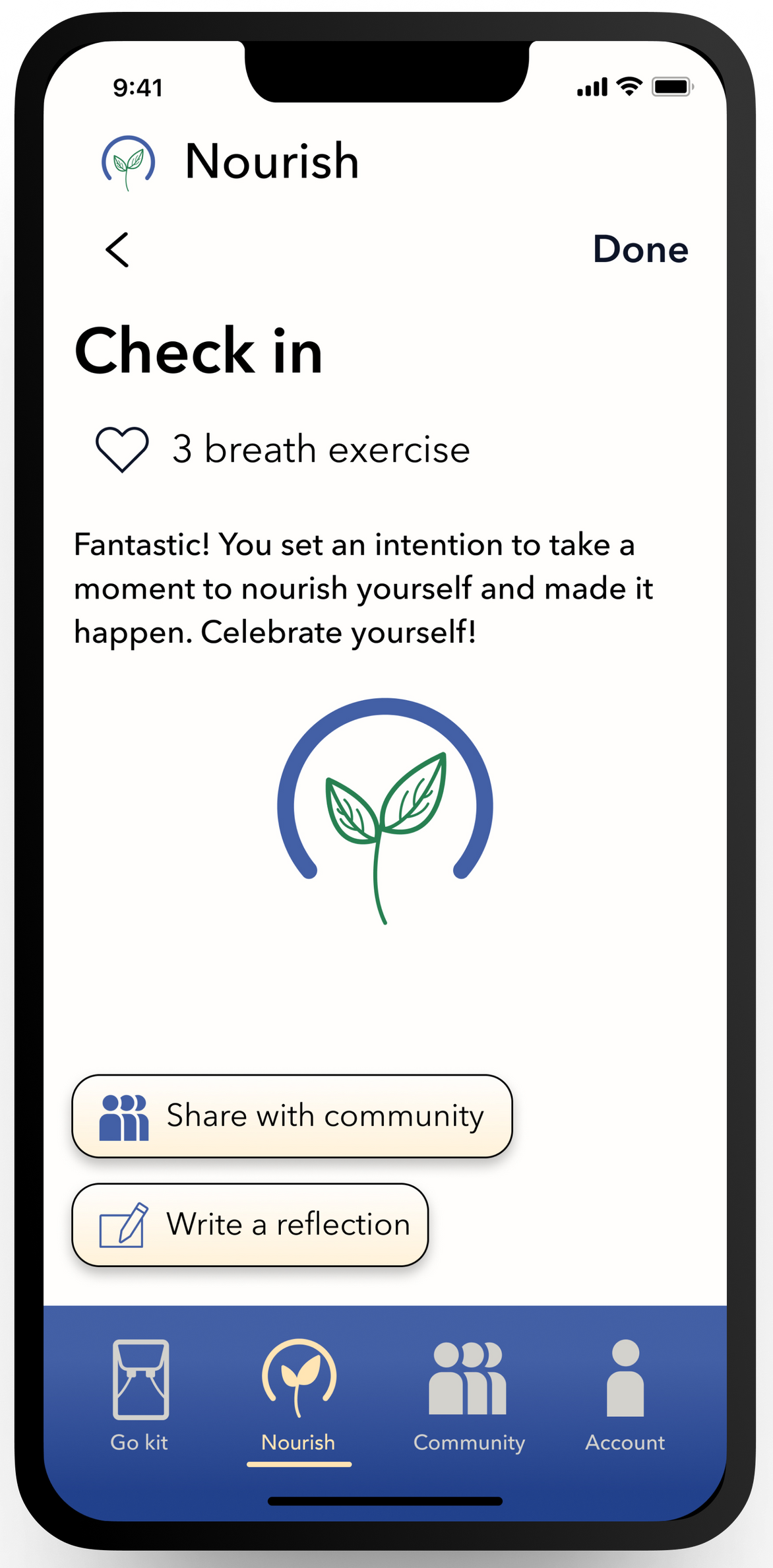
This mobile app project addresses a key constraint for parents—time—and challenges common beliefs about self-care to offer a flexible, customizable, and supportive framework that creates a lasting impact for users in testing.
Mini Case Study
In progress projects producing measurable results in real-world constraints.
Creating New SaaS Templates via User Research
31% Average Improvement
Across all core user experience vectors - ease of use, layout clarity, and brand trust - over the original designs.
PROJECT IN PROGRESS: Certain details are omitted while project is in development.
The Problem
A SaaS company wanted to overhaul its commercial website template products using data-driven user research. However, the team needed deep UX expertise to bridge the gap between raw research data and production-ready design architecture—ensuring the new templates didn't just look aesthetically pleasing, but actively guided users to successfully complete tasks.
The Strategic Solution
Operating as a UX Subject Matter Expert, I partnered with the Web Design and Product Design managers to inform research direction, build research-grade artifacts, and manage the UXR pipeline:
- Formulating Intentional Research Queries: Contributed foundational questions adopted into multiple rounds of user testing, shifting the focus from superficial aesthetics to deep, task-based user experience metrics.
- A/B Testing Content Layouts: Designed structural framework variations for live testing—including a highly successful blank instructional template engineered specifically to guide users through complex layouts.
- Proactive Synthesis & Master Framework: Recognizing that raw data packs are difficult to synthesize uniformly, I proactively pitched and executed a visual solution: I used research insights to build a high-fidelity reference template, incorporating realistic imagery, copy, and clear information architecture to serve as the team's visual blueprint.
- Cross-Functional Enablement: To streamline subsequent production, I built and distributed to the team an AI prompt framework to ensure accurate, consistent copy generation across the new template ecosystem.
- Interim Pipeline Leadership: Served as the explicit, delegated point of contact for the entire UXR relationship while the Web Design Manager was out of office.
The Strategic Outcome
- The "Gold Standard" Blueprint: Leadership officially designated my high-fidelity reference template as the organization's "Gold Standard," distributing it across the entire design org as the master framework for translating user research into future template products.
- Business Impact and Launch Readiness: Established a data-validated foundation for the upcoming product release, with final testing cycles confirming a 31% average metric improvement over legacy designs across all core user experience vectors (ease of use, layout clarity, and brand trust). By delivering the foundational internal framework, this initiative has effectively de-risked the upcoming launch, aligned cross-functional production teams, and positioned the new template ecosystem to drive immediate customer adoption upon public release.
Web Design
As of mid-2026, I have helped over 90 clients at Neon One to create or redesign their websites, completing projects in fast timelines and educating clients on handoff so they can feel confident in operating their site.
World Oregon
Problem:
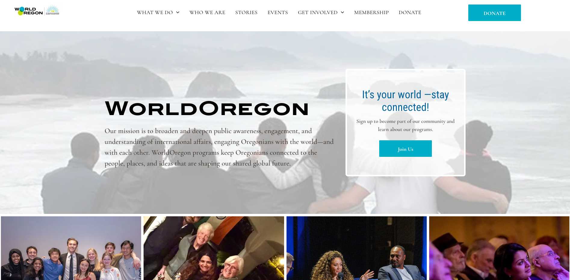
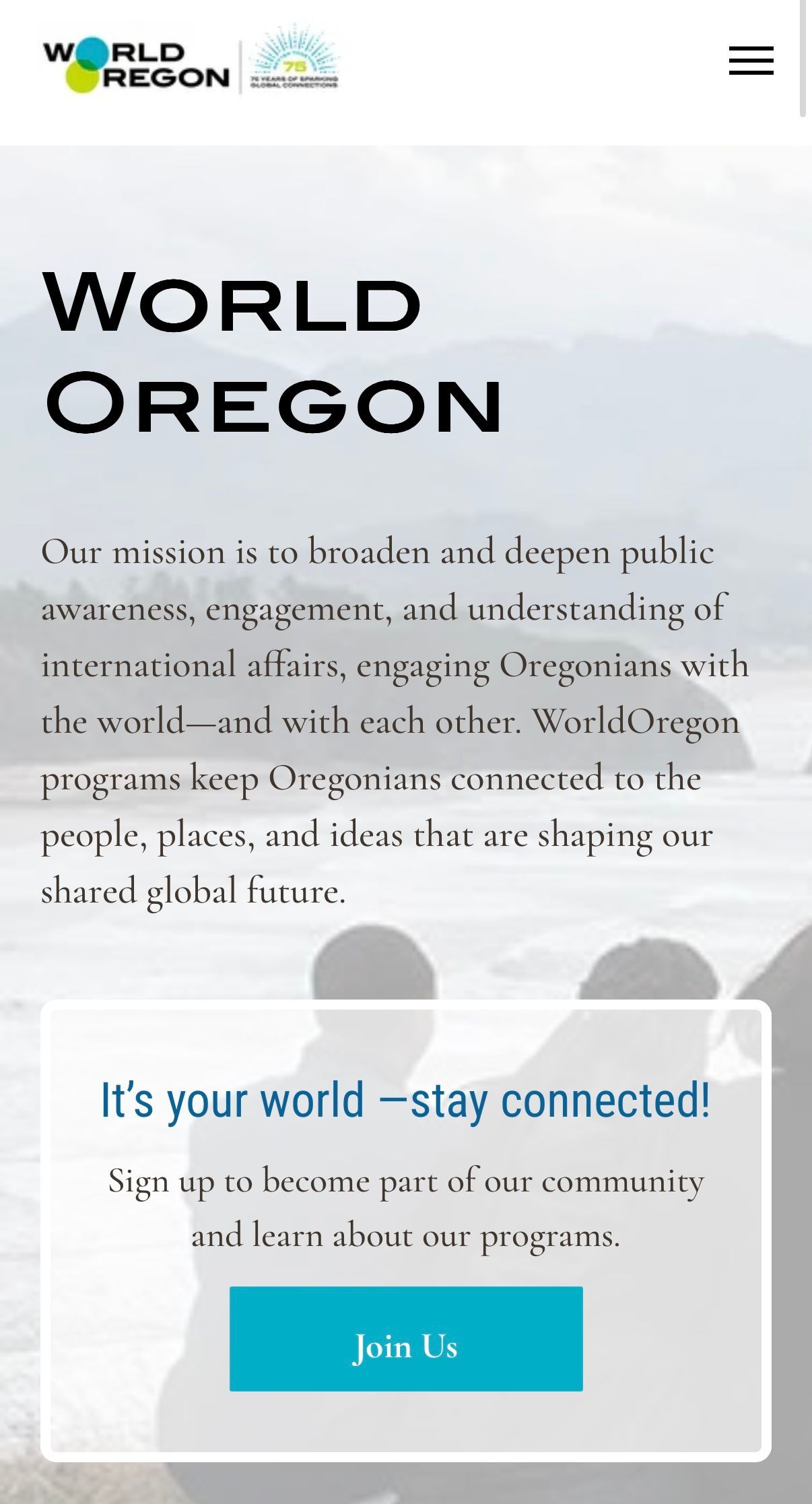
The website had a wealth of great content but needed a clearer structure to guide users toward key actions and engagement opportunities. The existing layout presented challenges in surfacing important updates and events, making it difficult for users to quickly find what mattered most.
Solution:
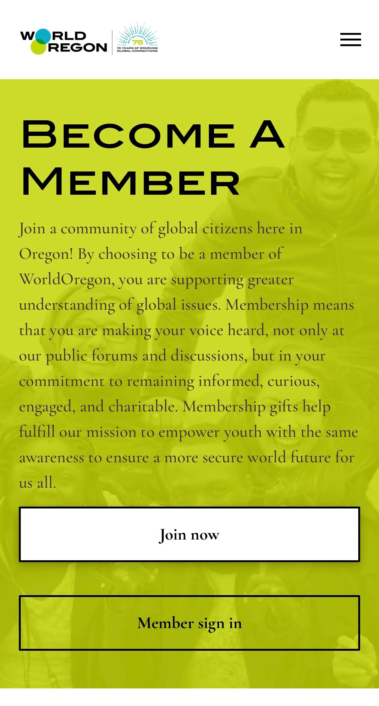
- Restructured homepage with clear primary CTAs and a mission statement above the fold with a strong hero image.
- Designed program cards with icons, headers, concise descriptions, and “Learn More” buttons for improved scannability.
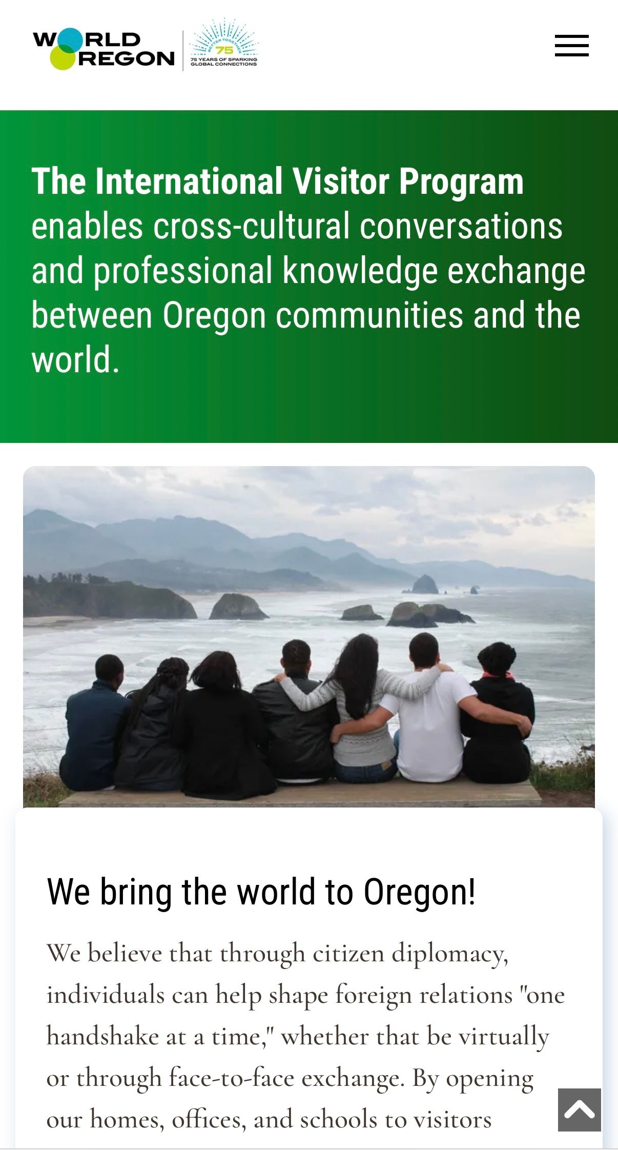
- Created a long-form programs page with anchor links as a strategic workaround for platform limitations, allowing for better content organization.
- Used brand colors, strong typography, icons, and callout sections to create visual separation while maintaining consistency.
- Added subtle fade-in animations for a more polished look.
Outcome:
The redesign continues to serve the organization well, remaining in place nearly a year later—reflecting its long-term usability and impact.
The Forum of Executive Women
Problem:
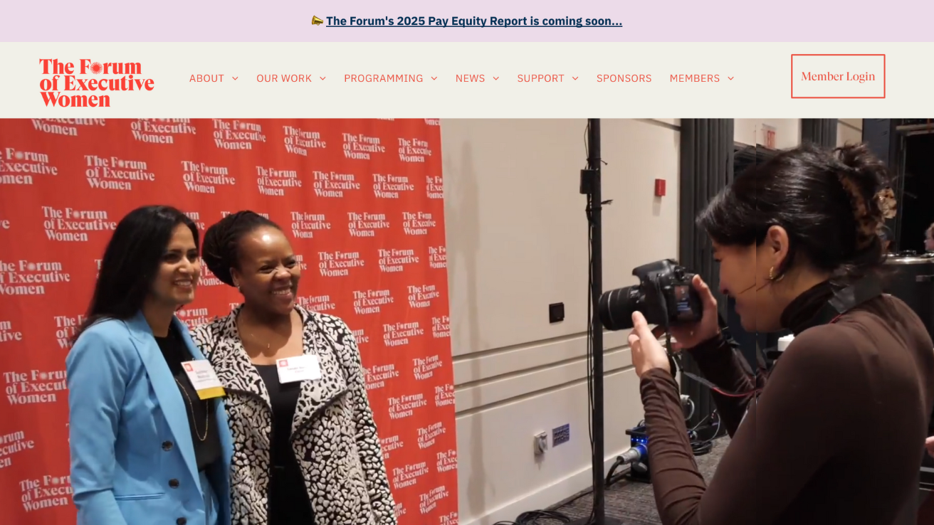
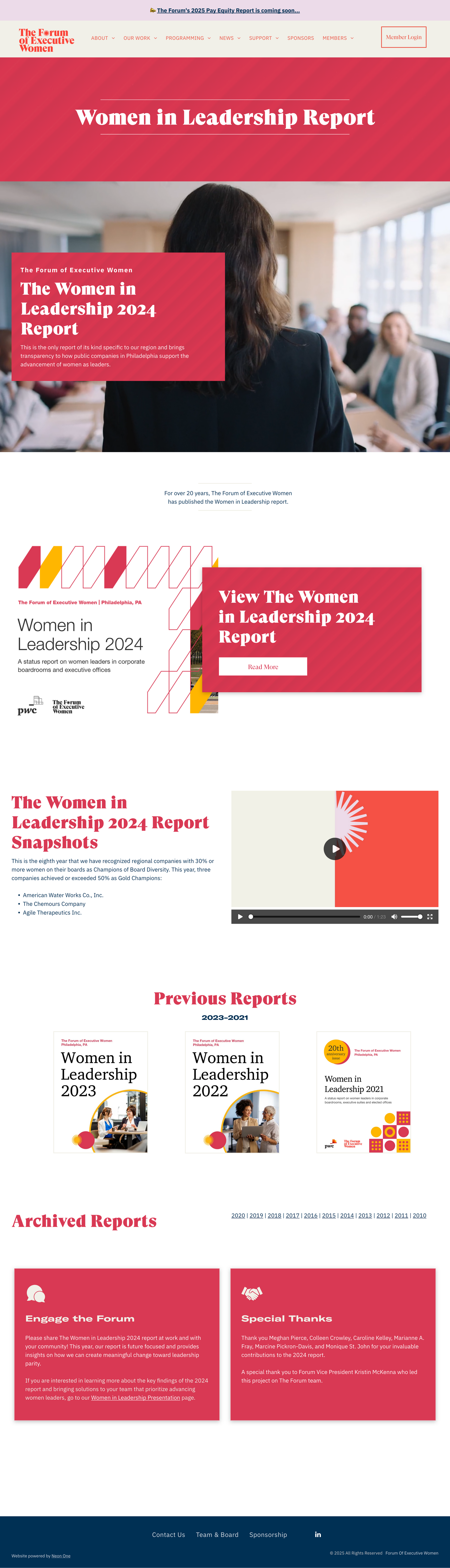
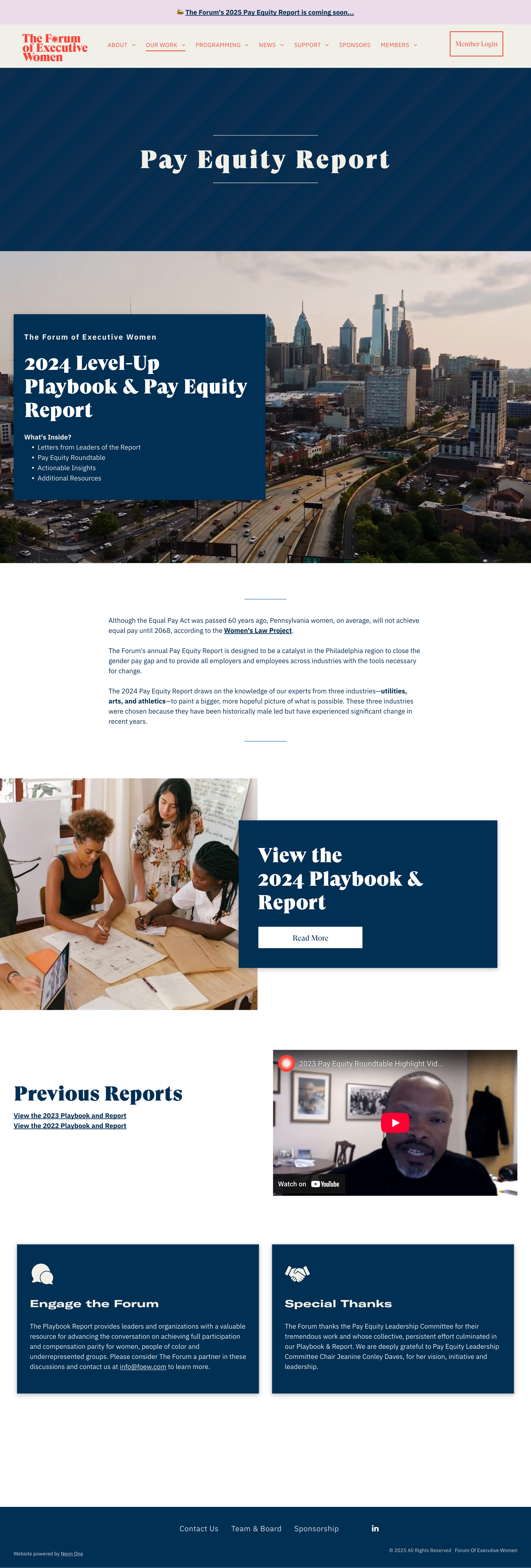
The organization’s previous website was outdated, with a text-heavy, black-and-white layout that lacked visual engagement. The site did not reflect the professionalism or vibrancy of its members and had inconsistent styling across pages. Additionally, the client was navigating a high-stress launch and needed hands-on guidance to ensure a smooth transition.
Solution:
- Revitalized the Site’s Aesthetic –
- Implemented their new style guide to create a modern, dynamic design.
- Introduced video backgrounds and structured color usage to enhance visual engagement.
- Improved Layouts for Better Readability –
- Designed more engaging layouts with overlapping columns and dynamic elements.
- Ensured consistent styling across headers, colors, and typography for cohesion.
- Client Empowerment & Training –
- Provided hands-on guidance before and after launch, ensuring the client felt confident in managing updates.
- Set up a project page template, which the client successfully used for additional pages, maintaining a professional and consistent look.
Outcome:
A visually engaging website that reflects the prestige and impact of the organization.

Tuleyome
Problem:
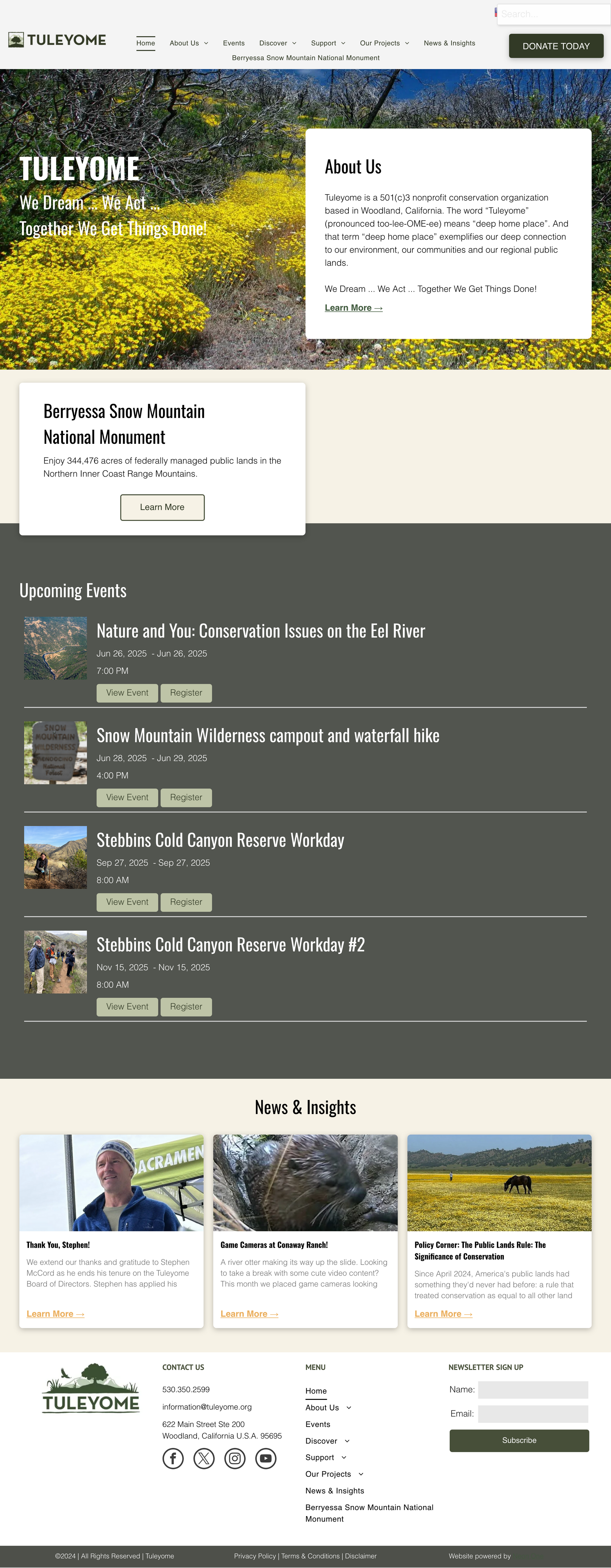
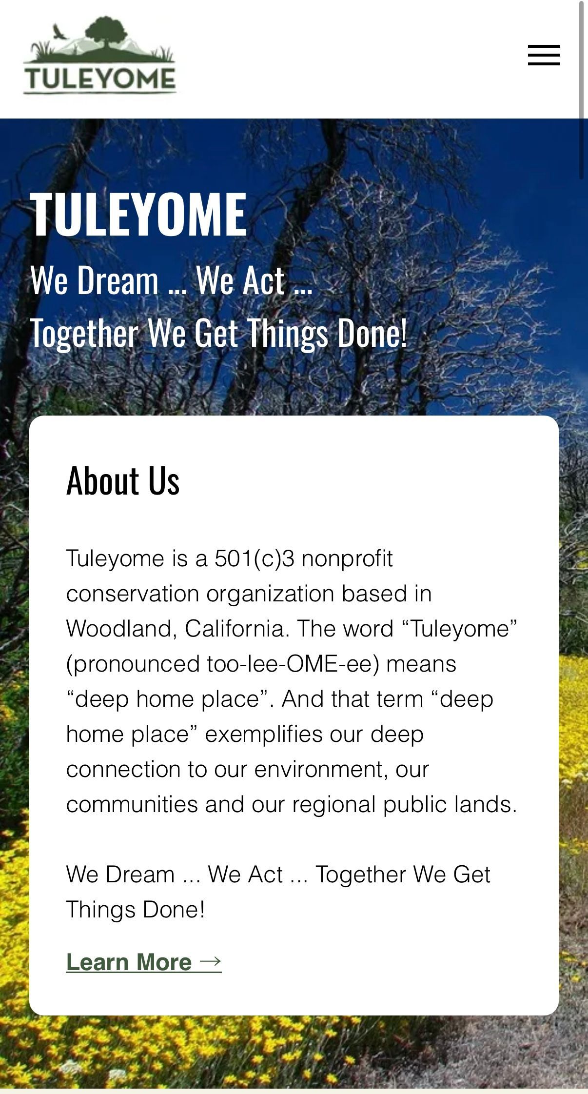
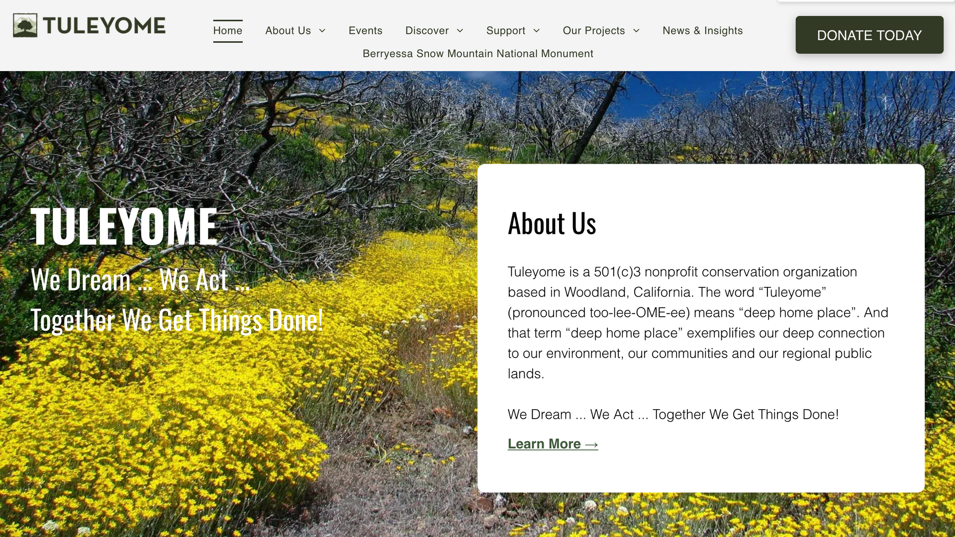
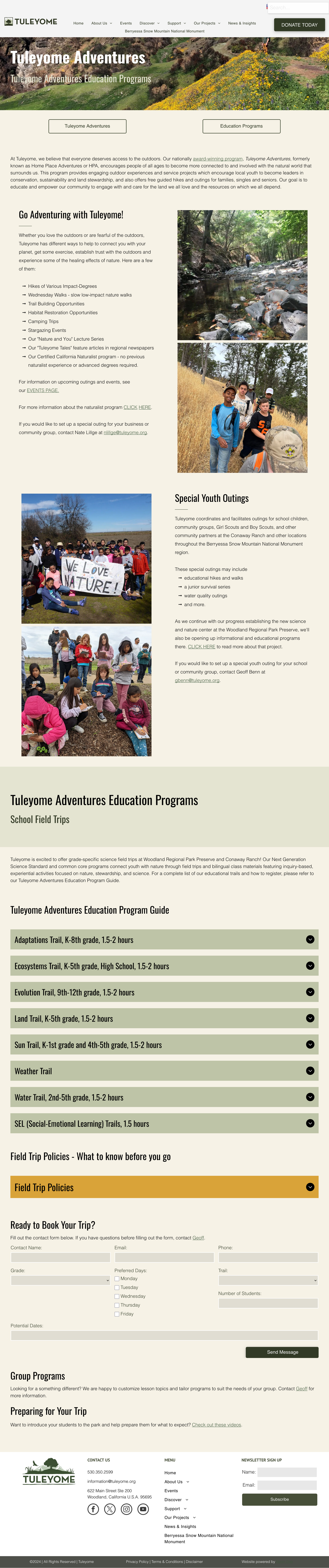
The organization previously maintained two separate websites, leading to a fragmented user experience. Website 1 housed general information, while Website 2 contained actions such as blogs and volunteer opportunities—each with different structures and navigation. This made it difficult for users to find information or move between sites seamlessly. Additionally, a significant amount of historical data and documentation related to a national monument project needed to be presented in an accessible and organized manner rather than a long list of links.
Solution:
- Unified the Websites – Merged content from both sites into a single, streamlined platform to eliminate confusion and improve user experience.
- Organized Large-Scale Data – Imported and structured an extensive collection of PDFs related to the national monument project.
- Designed an accordion-style layout, organizing PDFs by year for easy navigation.
- Scalable Project Page Design – Created a project page template that allows the client to easily duplicate and update future project pages.
- Client-Friendly Structure for Handoff – Consolidated pages and implemented anchor links to maximize content organization within the package's six-page limit.
- Ensured global styling consistency to simplify future updates.
Outcome:
Nearly a year later, the site remains largely as designed, with many updates and pages added by the client that are cohesive with the original design.
Featured Project: B2B Multi-Channel Brand System
Context
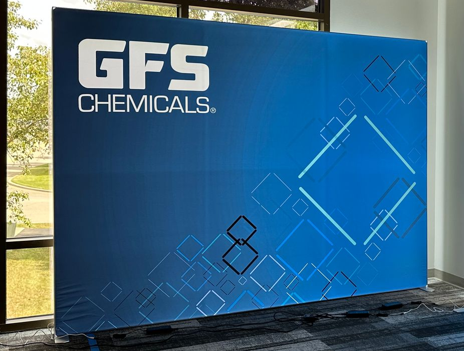
The company needed a trade show banner but had relied heavily on the familiar hexagonal patterns common in the scientific industry.
Challenge
Leadership wanted to stand apart from competitors in trade shows while maintaining a professional, science-driven tone for a B2B audience.
Approach
I designed a custom layout in Figma, creating an energetic, diamond-based pattern from their existing brand colors. The design balanced precision with creativity—dynamic enough to feel fresh, yet structured enough to feel credible.
Outcome
Leadership immediately embraced the design.
What began as a single banner evolved into the foundation of their rebrand, now seen across hundreds of print and digital materials.
A small project became a defining visual system—proof that thoughtful design can drive strategic transformation.
Having had the pleasure of mentoring Kerry with her design career, I am delighted to endorse her exceptional talents. Kerry not only possesses outstanding communication skills and consistently meets project goals, but her innate ability to innovate and swiftly adapt to new tools sets her apart as a talented designer.
Anthony Faria, Designer
Kerry McNamara’s work on our website was professional, creative, and efficient. The site looks great and functions intuitively. I couldn’t be more pleased!
Dr. Russel Mikkelson, Director of the Heisey Wind Ensemble