A Century of Innovation, Undercut by an Outdated Website

Client

Socio LTD.

Year

2020

Role

UX Lead (Contractor)

Client

GFS Chemicals

Team

Marketing and developers, plus a third-party team on the product catalogue

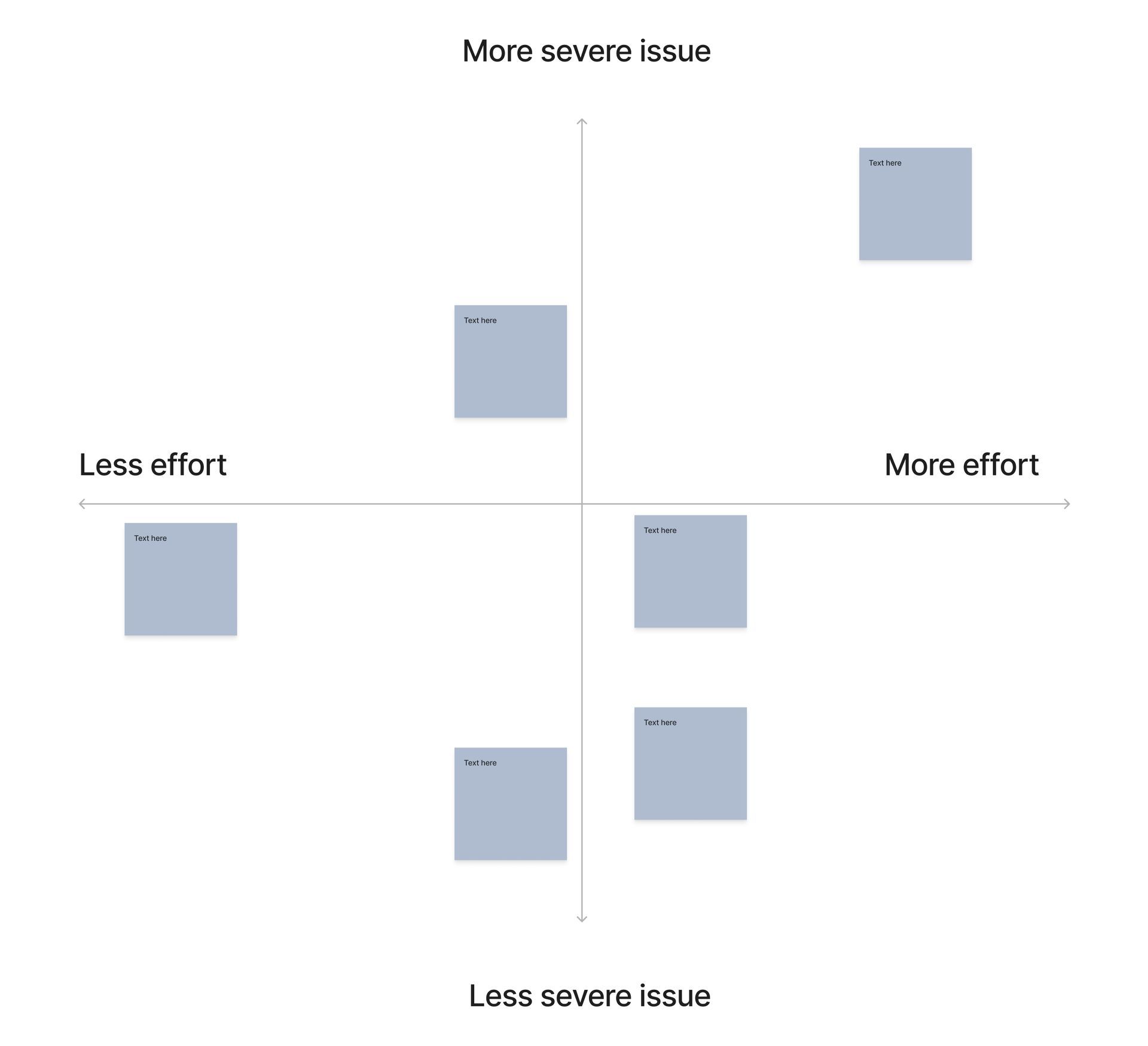
Prioritization
Prioritization

Information Architecture

Wireframes
Wireframes

Usability QA
Usability QA

Audits & Analysis
Audits & Analysis

The Website Stopped Matching the Brand

GFS Chemicals has built its reputation over nearly a century in the industry, priding itself on innovation and strong customer support. But its outdated website undercut that story — a non-responsive layout, busy navigation, and a clumsy product catalog got in the way of both the innovation and the personal connection the brand was known for. I led the structural UX work to close that gap, from early analysis through development handoff.

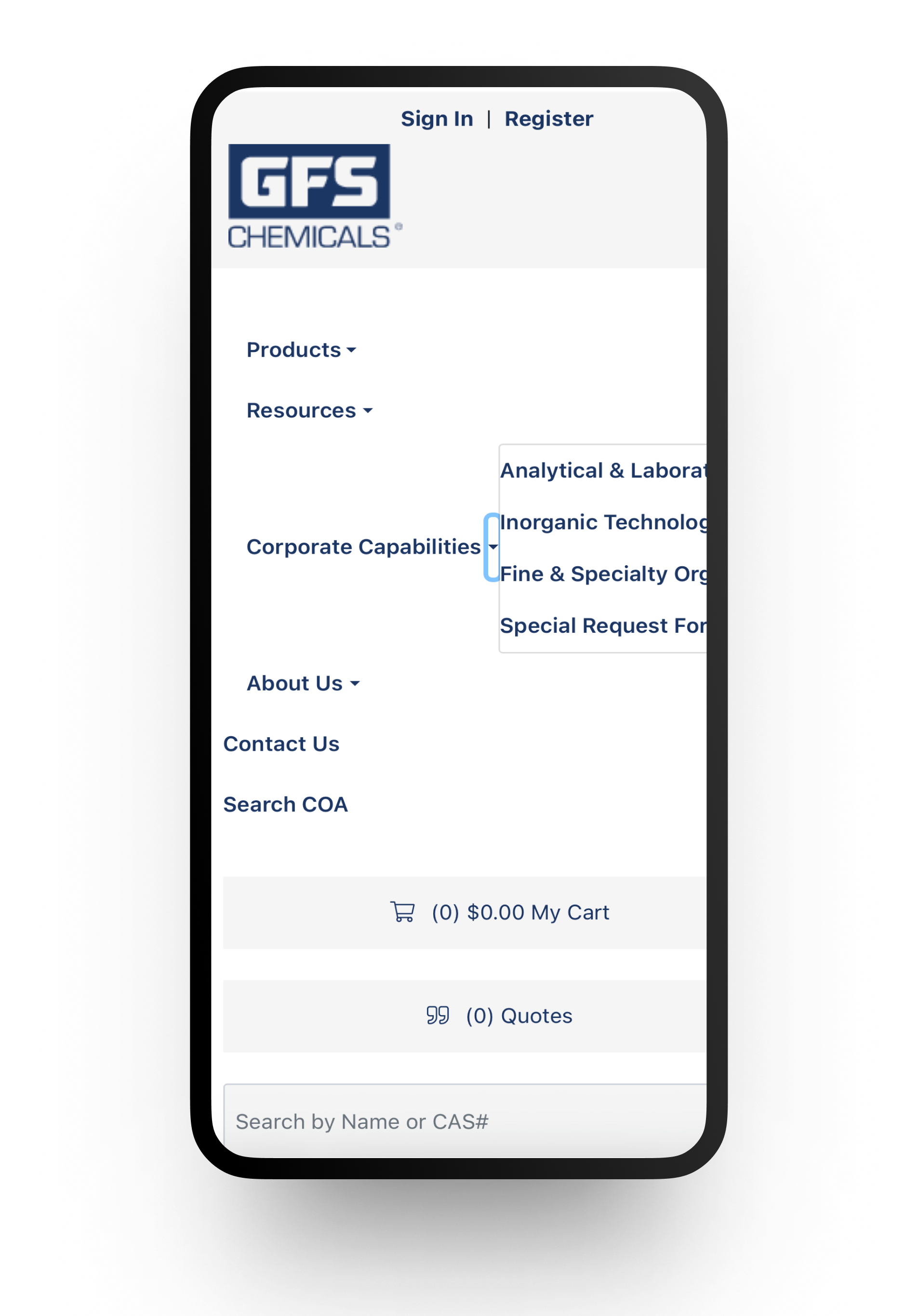
Mobile site non-responsive

Confusing user flows at checkout

Busy navigation

Unclear  information hierarchy

Achieving Results within Contraints

How does one bring a UX process to a project that has zero budget for user research or testing? Rather than guess, I leaned on established UX heuristics, accessibility standards, observations from employees, and best practices. 

Best practices and accessibility standards

IA and wireframe recommendations

UX heuristic and QA audits

No budget for user testing or research

Technical constraints

Small team

Result

+13% YoY Sales Growth

Reported by the client following new website launch

PROCESS

Bringing Proactive and Streamlined Communication to a Large Process

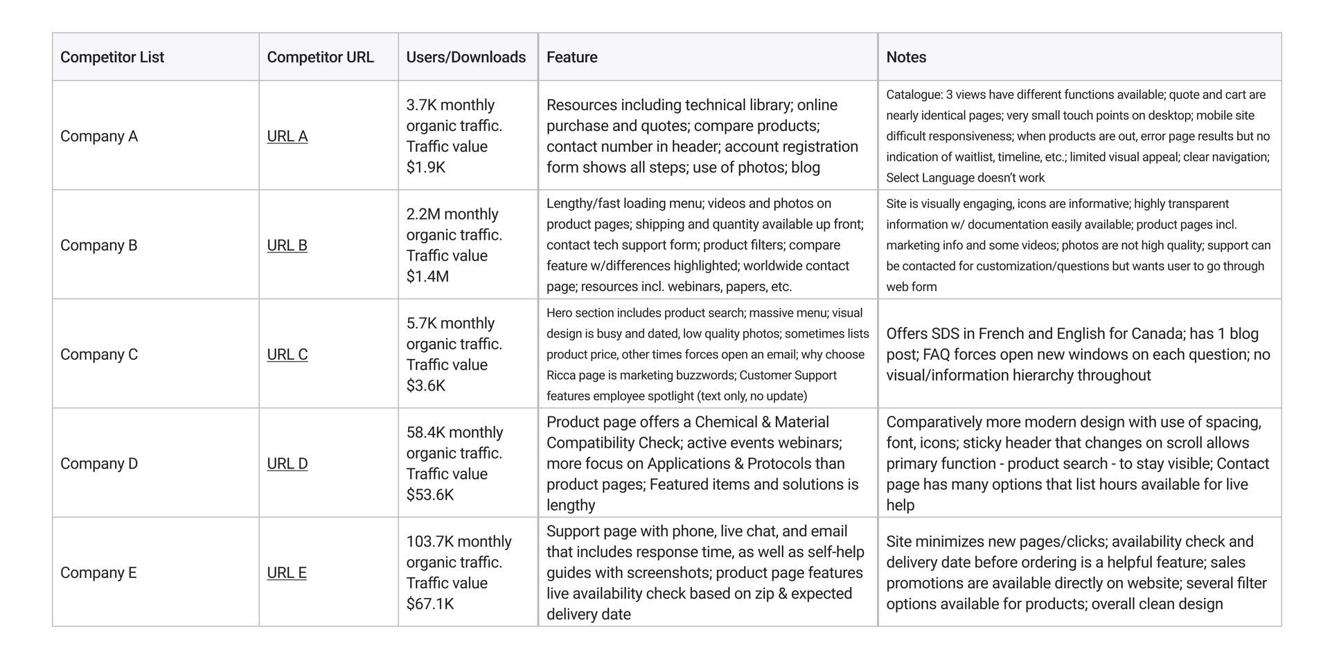
The project didn't begin as a redesign brief. I proactively ran a competitive analysis comparing the client's site to industry peers — that analysis is what opened the conversation about overhauling the site.

Competitive Analysis

Analyzed websites of 4 industry peers, which validated structural changes.


UX Heuristic Audit

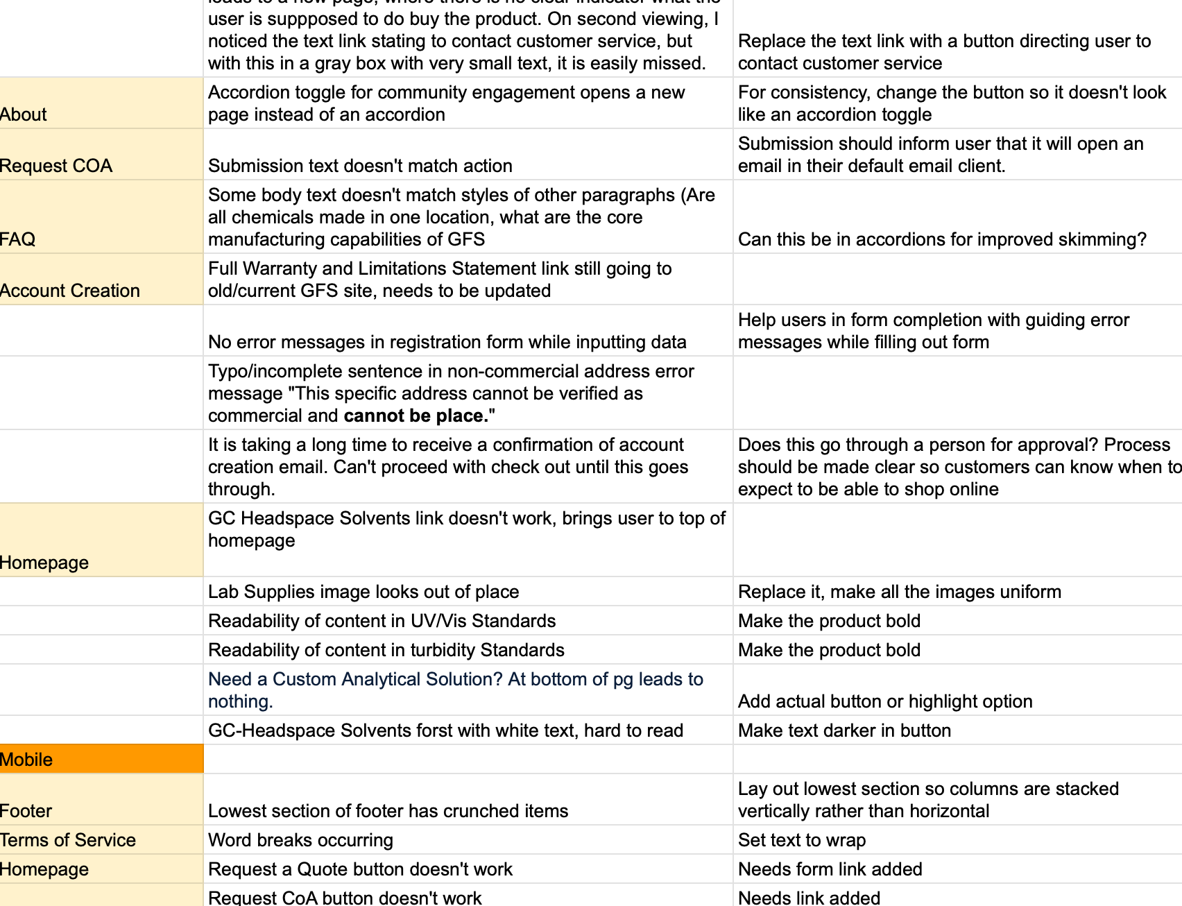
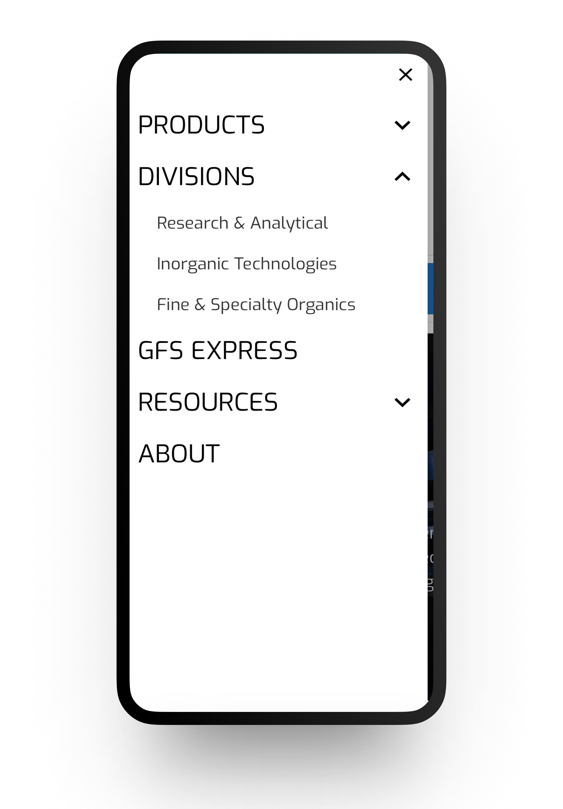
Identified for leadership usability concerns, such as the mobile submenus breaking standard conventions.


Navigation/IA

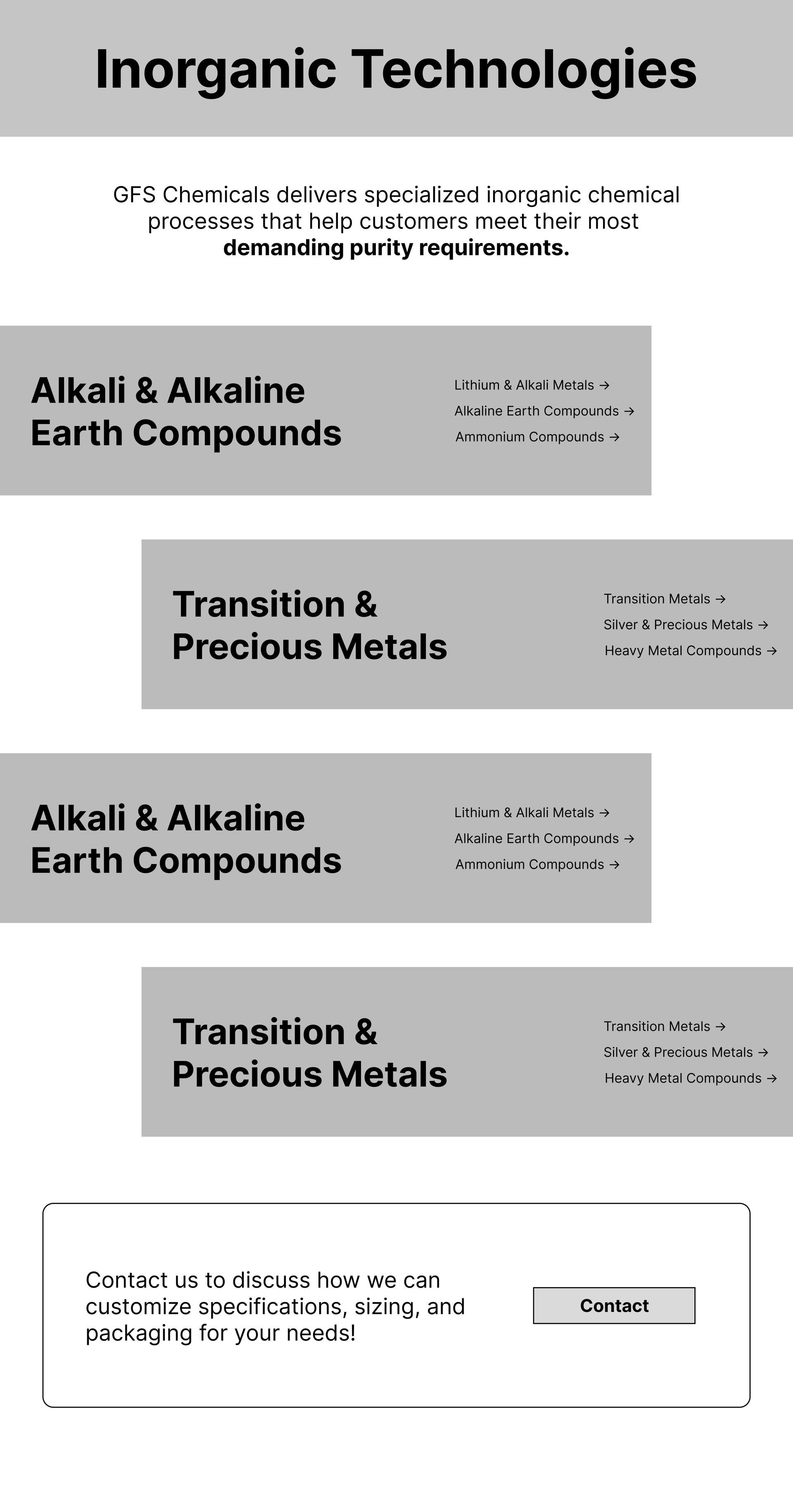
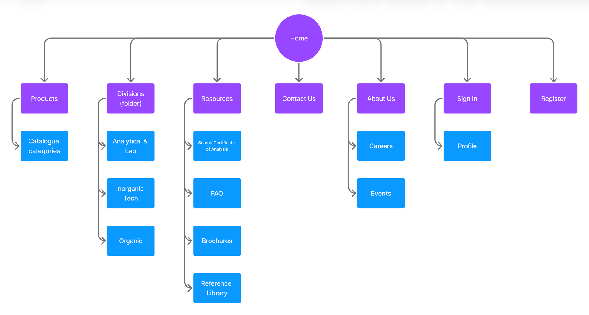
Built a sitemap and submitted simplified versions of website navigation to direct users to sales funnel.


Style Guide

Aligned teams with a style guide for design consistency.


Wireframes

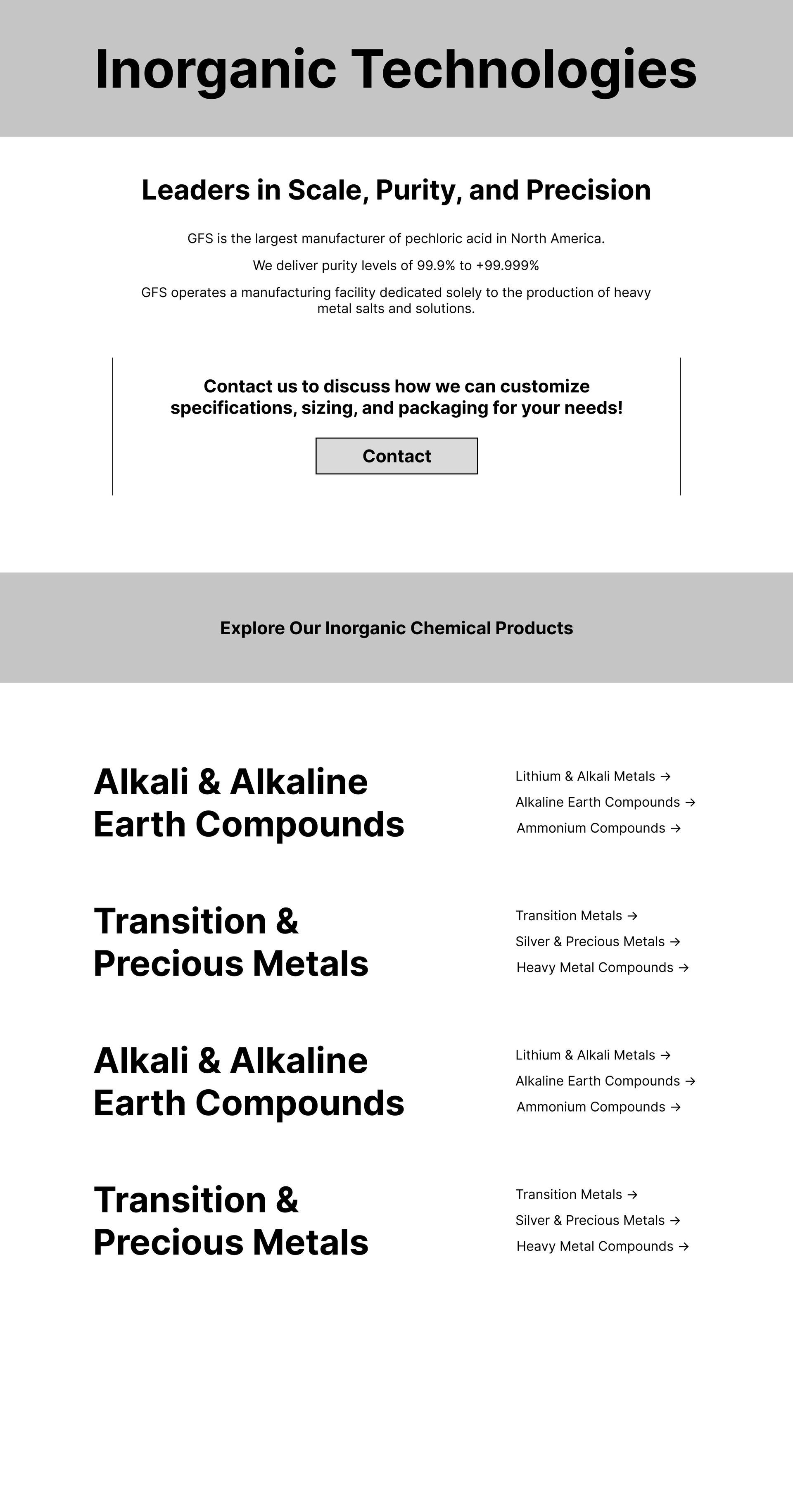
Created low to mid fidelity wireframes to help guide final implementation.


Project Planning

Aligned with new leadership on project and next steps with proposed structure to prioritize feedback.


QA/Usability

Implemented clear speadsheet for developers to


Lessons Learned

When I was first told the project would move forward without user research or testing, my initial reaction was uncertainty; interaction with users is a foundation most UX processes are built on, and I'd need another way to make confident decisions without it. Rather than default to personal preference or guesswork, I turned to what was still available: heuristic evaluation, accessibility standards, competitive benchmarking, and structured audits of the live site. 
How to "Make It Work" Within Constraints

Reframed the problem — Instead of guessing, I identified what evidence was available: heuristics, accessibility standards, competitive benchmarking, and structured audits of the live site.
Kept decisions evidence-based — Every structural choice traced back to a specific finding, not personal preference, even without formal research to lean on.

Delivered on the goal anyway — A fully mobile-responsive, on-time launch that drove a 13% YoY sales increase in the first month.

The real takeaway — Good UX process adapts to real-world constraints. The method isn't fixed — the commitment to evidence-based decisions is.

Let's work together